AI has become a very popular topic and it has been all the rage in recent business trends. How can it be implemented and how can it be useful in new and creative ways? Classically trained AI bots appear to be getting smarter, more natural, and better by the day. So how is that an experience can be applied to these chatbots in order to make the interaction process fun, exciting, and usable?
My Roles
UX Team Lead
Primary Researcher
Usability Tester
Project Manager
Project Advisor
UX/UI Team of 4
The Team
Figma
Discord
ChatGPT
Main Tools
So… what are we trying to do?
The project lead tried learning to cooking using Chat GPT as their guide. He asked all the questions he could think of and got pretty useful answers. This gave him the idea to add an experience to this process, by creating an entirely new app to make the interactions with the AI fun and useful.
Let's talk research
I was the primary researcher for this project. I made it the goal to research how people learn to cook, solutions to commonly experienced problems with home cooking, and most importantly looking into how AI could be utilized in the cooking assistant space.
What do we hope to achieve?
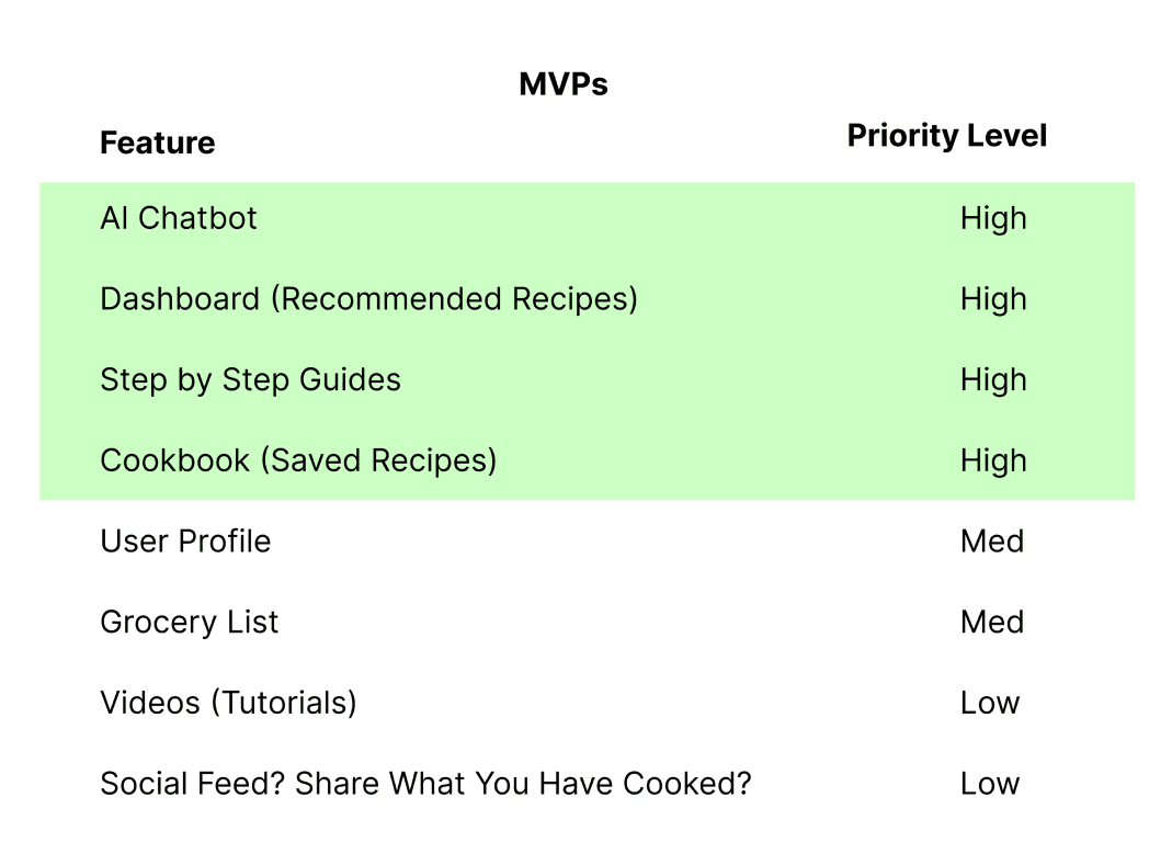
My team and I had to create this app from scratch. We brainstormed together and defined our MVPs for the design portion of the project.
Early Sketches and Ideas
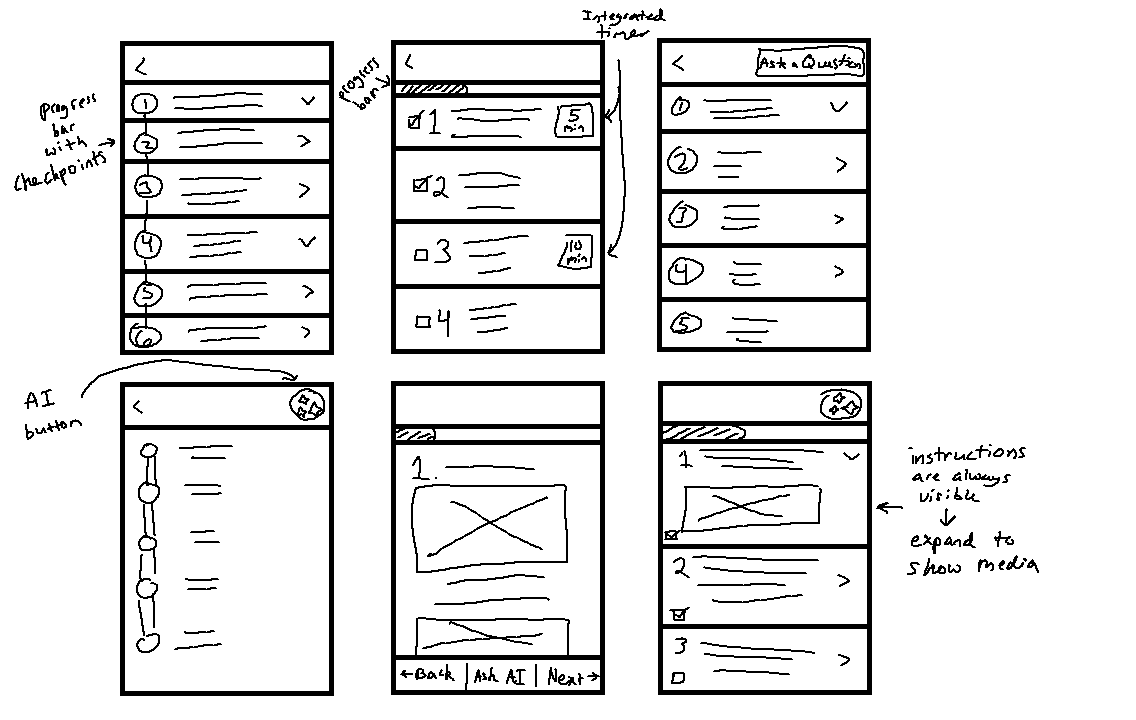
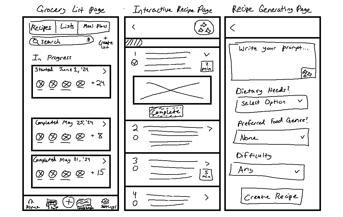
We dove right into brainstorming the potential layouts of the most important pages through sketching. I tasked the team, myself included, to sketch out some quick brainstorm sketches to get their ideas on paper. Then I recommended that they pick their favorite ideations to sketch out into cleaner and more legible drawings.
I focused on the dashboard, cookbook, and interactive recipe page for the rough brainstorms. Below are some examples of these brainstorms.
At this point I jokingly suggested we name the AI bot Cookie because the classic AI sparkle graphic reminded me of a chocolate chip cookie when recolored.
The team liked the idea, so Cookie was adopted as the AI assistant's name.
Wireframes
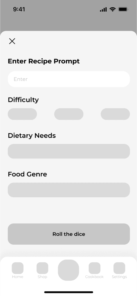
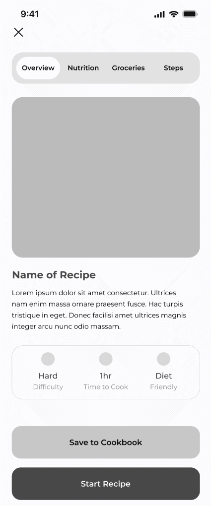
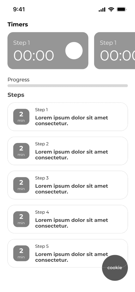
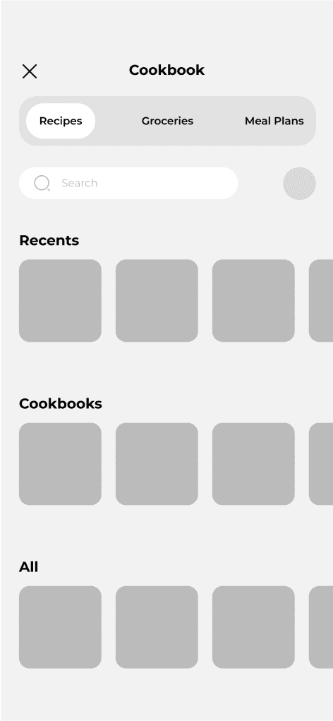
I wasn’t too involved with the wireframing of the project, but I did provide feedback and design input when needed. Showcased below are just a few of the low fidelity screens shown to our clients. The screens included below are the early designs for the AI recipe generation screen, recipe overview, interactive recipe page, and the cookbook recipe.
It is important to note here that there are features and layouts demonstrated in these screens that were eventually scrapped in later iterations.
High Fidelity
Moving into the high fidelity portion of the design process, I was more involved. On top of recruiting participants for the usability tests, I was also heavily involved in the design of the hi-fi screens and their prototyping. My thought process being: if I don’t understand the designs and the way they interact with each other, how could I effectively moderate usability tests?
Usability Test Results
After prototyping the hi-fi screens, I set right to work with the usability participants I had previously recruited from the user interview screener survey responses. The demographic were ages ranging from late twenties to early thirties, 75% female, and all about equal in terms of home cooking experience: they had some experience, but no one cooked everyday.
- There were no explanatory prompts or context clues to help users learn how to interact with the AI.
- The buttons and interaction options did not stand out to users throughout the app.
- Users liked the feature, but the presentation and content left a lot to be desired.
A few of the users wanted the ability to create their own meal plan instead of relying only the AI.
- There was such a heavy focus on the AI interactions that the experience felt more like the AI was driving everything instead of function as an assistant.
Moving into iterations, giving agency back to the user had to be a primary focus.
An exciting statistic: out of all the usability test participants
100% would keep using Diced!
Visual Design
With about 5 days to the deadline, the graphic designer started to put some life into the screens by adding color, branding, and graphics while the rest of the team continued to improve the features.
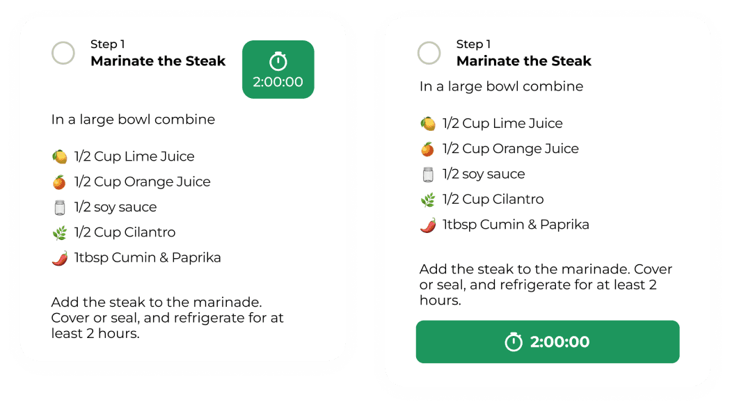
There were a few iterations our clients suggested that we really tried to work through and implement. One of these being moving the timers in the interactive step-by-step up next to the step’s title. It was decided that this change was too visually cluttered, so it was reverted back to the original shown below on the right.
Last minute, previous bottom toolbar was scrapped in favor of a 5-button layout that broke up the original cookbook idea into their own tabs.
Diced! The final product in review
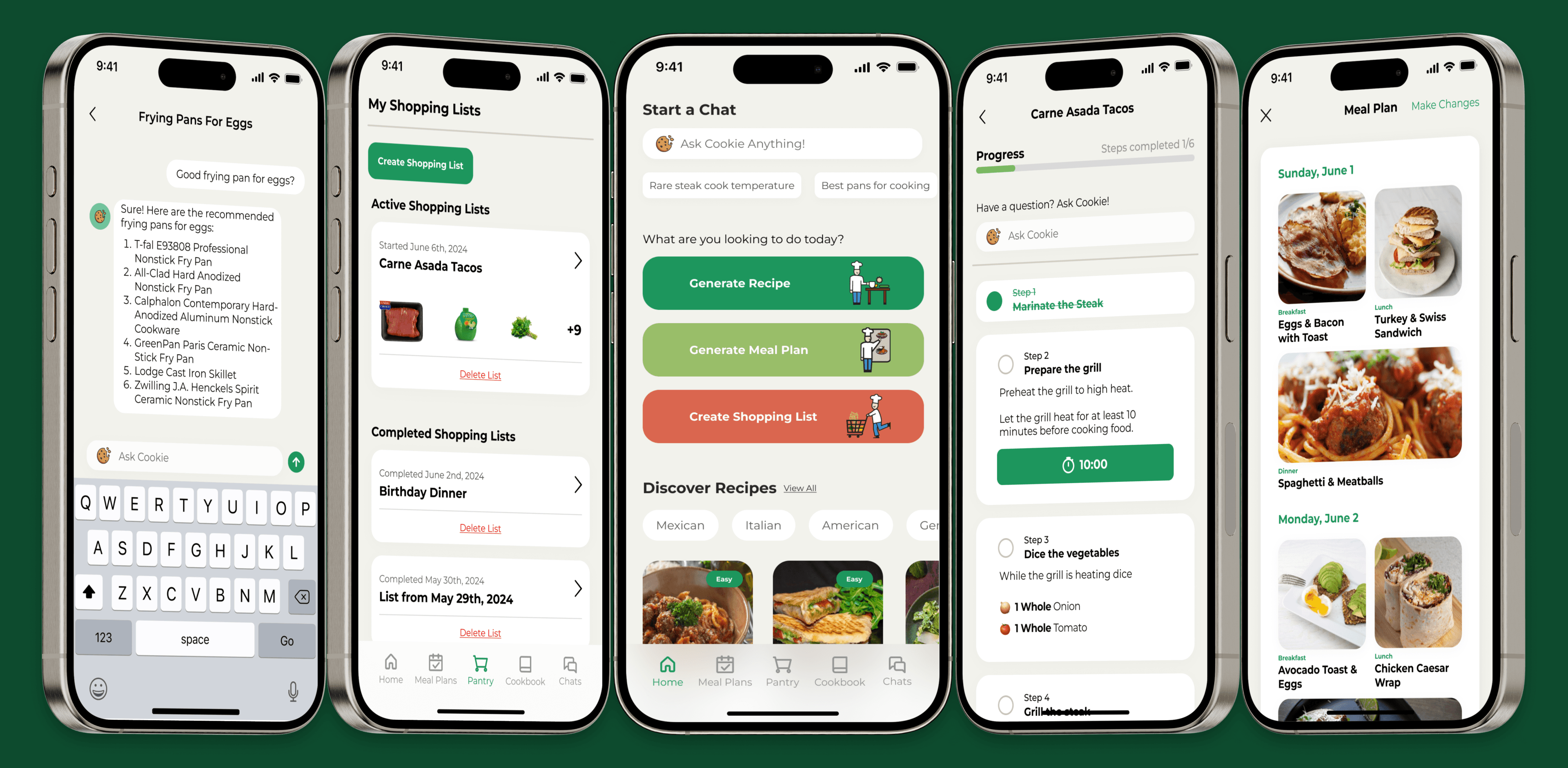
Introducing Diced! Your new favorite AI cooking assistant. Let Cookie - your virtual sous chef - offer advice, recommendations, and guidance alongside your home cooking journey.
Feel like a rookie? Just ask Cookie!
Cookie will always be ready to answer any sort of cooking and kitchen question. From types of cookware to the difference between steak cuts, Cookie will have the answer. Chat with Cookie whenever you’d like, so you can get out into the kitchen armed with new knowledge. Forgot an answer? No worries! You can go back and reference your previous chats anytime.
In a hurry? No need to worry
Diced! offers a comprehensive recipe generator to suit your various tastes. Want a certain dish? Just type in the name and Cookie will create the rest for you! Don’t know what you want to eat? That’s okay too, just roll the dice and see what you get!
Don’t like an ingredient or two? No worries, the ability to substitute ingredients is but a button press away. If you’re not sure what to substitute, let Cookie help!
Interact with the recipe, asking questions along the way if you get stuck. The embedded timers, easy to read steps, and AI assistance make sure there’s less flipping back and forth between apps! Keeping it all in one place so you can focus on your food and making it the best it can be!
Have a recipe of your own? Let it be known!
Save your favorite recipes to your cookbook, organize them however you like, and even add your own custom recipes to keep everything in one place! Your cookbook is an extension of your palette and preferences, so fill it up with tastes you’ll always want to come back to!
Track your shopping list, that’s the gist!
Add the ingredients from specific recipes with the tap of a button, or add what you need yourself! Combine, change, and tailor your grocery lists to make your next trip to the store a breeze. Cookie can even remind you about the items you’re always adding to your lists, so you never forget your favorites! Check off your ingredients as you find them in the store, and even go back to look at past lists if you forget what you recently got!
Say “I can!” with your own meal plan!
Meal plan or meal prep by crafting your week in advance! Get organized and embrace variety to really shake your plans up week by week. Let Cookie create a plan for you by answering a few questions, make a plan yourself, or do a mix of both. Leave pantry browsing and fridge staring behind you and grab your week by the horns
Future Recommendations and final thoughts
Moving forward with these concepts, I’d highly recommend building integrated voice interactions with the AI. For example, adding a way to move through the interactive recipes via voice commands so the user doesn't have to worry about getting their phones messy. With voice recognition continuously improving, training the app and building these features would be a very smart endeavor.
Along a similar vein, it is important to keep in mind that when training the AI, it needs to be trained to keep its answers accurate and brief. Too easily AI responses get very wordy and they overwhelm the user with information. Keeping content digestible and readable is a must, especially when presented with a lot of information like a step-by-step recipe.
The tab that contains the user’s grocery lists was named “Pantry” because it could be smart to implement a pantry tracking feature later on. If the AI can be trained to utilize ingredients the user already has, it could take these into consideration when creating recipes. This could potentially cut down on the user’s food waste, and maybe even their normal grocery costs.
Closing Thoughts
I’m personally satisfied with the results of this project. Given the delayed timeframe, the amount of content and work that went into the handoff is nothing to sneeze at. I’m proud to report that our clients were extremely satisfied with the results, designs, and overall concepts.
If I were to do anything differently, I would have ensured that everyone on the UX team was on the same page from the get-go. I assumed everyone was coming into the project with similar expectations and experience, but boy was I wrong. There were some miscommunications that required I take on extra work to ensure the project stayed on track with the designated timeframe.
I wanted to mention a gratifying experience that came from this project. It actually came from the usability tests. In a response to my thank you email, one participant very kindly said:
“I’ve been raving to my family about your app! It’s a really good idea and I would really like to see it made!”
It reminded me that part of the reason why I’m designing is to help make people’s lives more enjoyable and fun through the experiences they have with products I’ve worked on. If I can help others get inspired, then I feel like I’ve accomplished something great.
