Scope
4 month project:
Learning UX principles
Applying recently learned principles
Solving a problem I saw in the world
UX/UI Designer
Tackled the entire UX process:
Research
Ideation
Design
Validation
Iterations
Embarking on a CreditQuest
Credit cards have been a money spending standard ever since the payment method became popularized in the 50’s and 60’s. Since then, the details and information surrounding them have become extremely overwhelming. I embarked on a UX journey to help solve this problem.
My role
We do not what be to left guessing
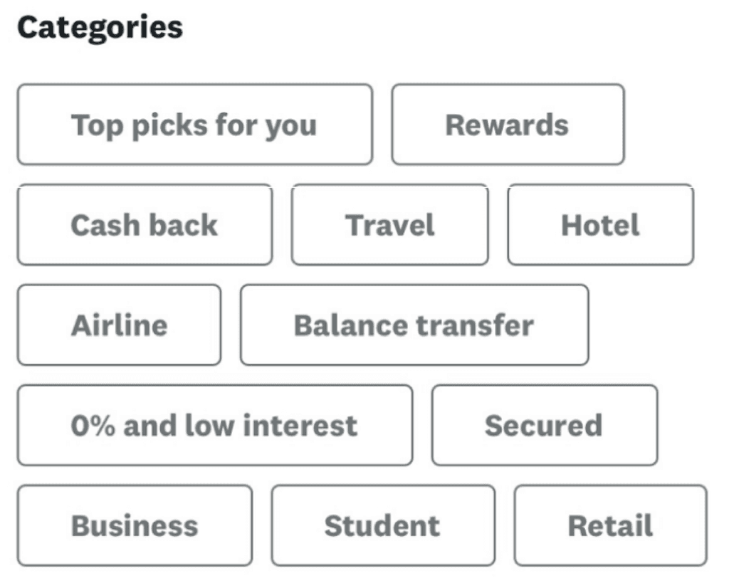
Most people know getting a credit card is important, but they do not know which cards can do what, or which would be the best for their situation. There are way too many options to choose from.
Financial literacy is a learned skill
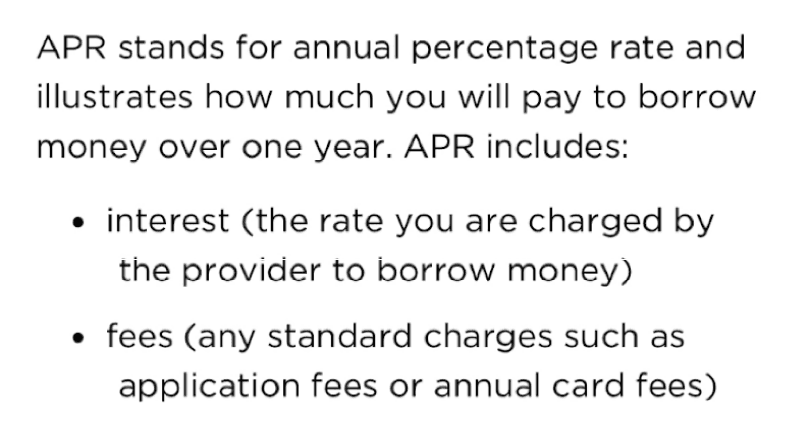
Many people do not understand what they are looking at the first time they open a credit card’s page, and they do not want to sift through boring articles to learn about what confused them.
The entire process is not intuitive
90% of the people I talked to had to ask for help in at least one step of their search. Credit cards are very common, but that does not mean the knowledge surrounding them is common sense.

Target Audience
Young, financially independent adults
- Little to no knowledge.
- They ended up choosing one of the first cards they saw, or one that was recommended by a parent or guardian in their lives.
- More than one wished that the terms, conditions, and information were easier to understand.
I am not afraid to admit that I approached this problem space without any specialized knowledge on the field itself. I had a lot to learn so I did what any novice would do: I conducted a competitive analysis to see how pre existing applications address the same problem. Three things became clear:
Visibility and ease of access is key.
Credit card apps present clear options and paths by making sure touch points and features are well labeled and have obvious functions. They are designed to be simple.
The user needs to be in control.
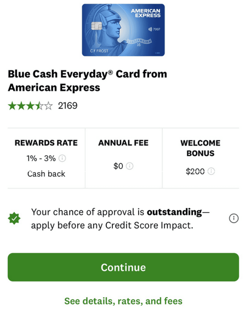
Users being able to to take control of their experience is top priority. Clearly explaining functions at appropriate times helps with a more intuitive approach to the feature.
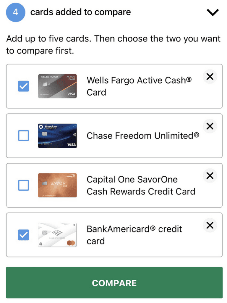
A push for outcomes, not understanding.
Credit card apps do a really good job at driving the sales pitch.. More often than not, these apps are used to find a quick solution at the expense of the user’s complete understanding.

Assumption
Credit card apps focus on speeding up the process of finding a credit card.
Implication
User's feel more confusion because they don't understand everything.
Moving into the design portion was extremely slow going for me because I was learning design theories and principles as I applied them.
The idea that drove my initial designs was a sort of “choose your own adventure” concept. I wanted to base the designs off a treasure hunting theme to play into the name of CreditQuest. This concept was toned down and eventually adapted to a more modern look in the final designs.
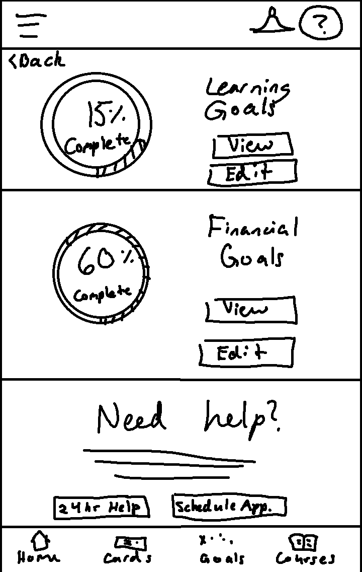
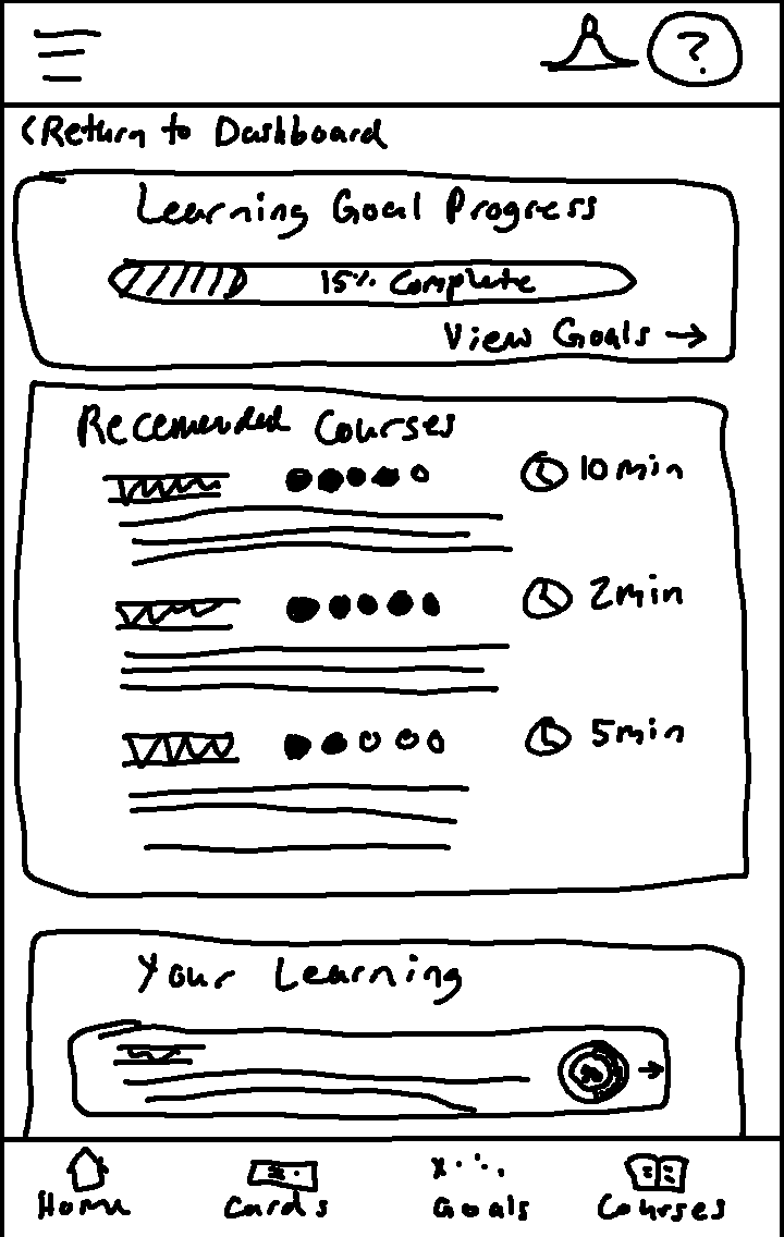
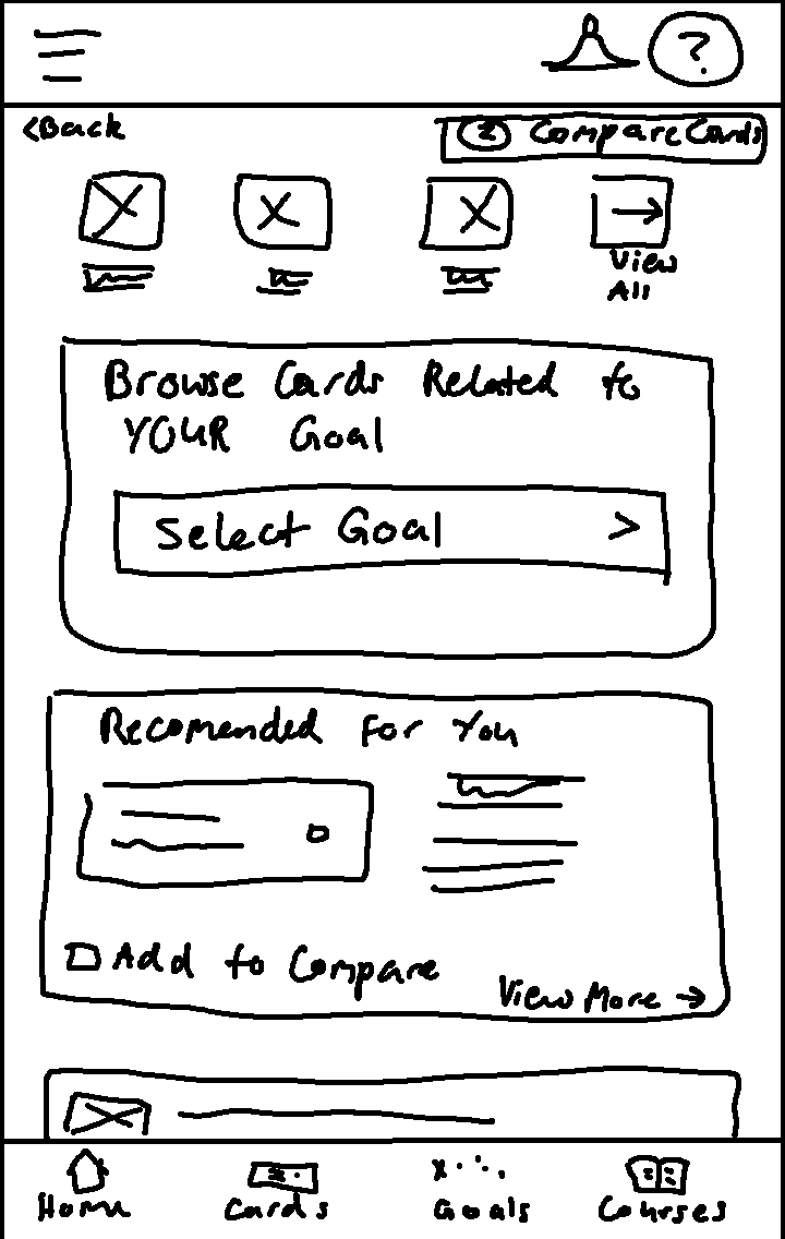
Gaining confidence with Figma
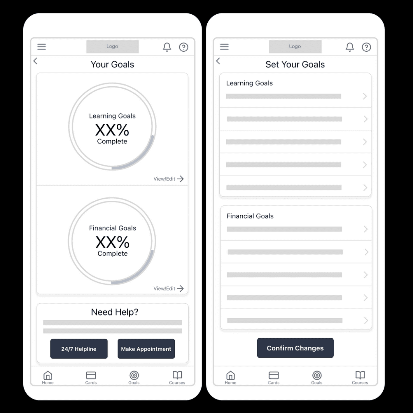
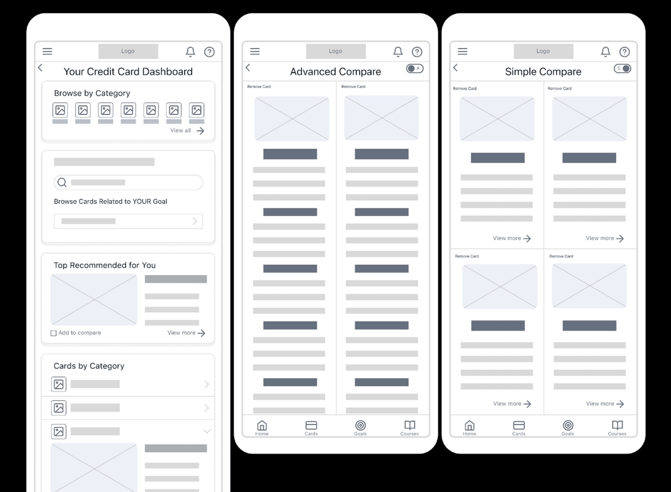
However, after receiving some extremely valuable feedback, I set back to work with the sole purpose of improving the designs and bringing them up to industry standard.
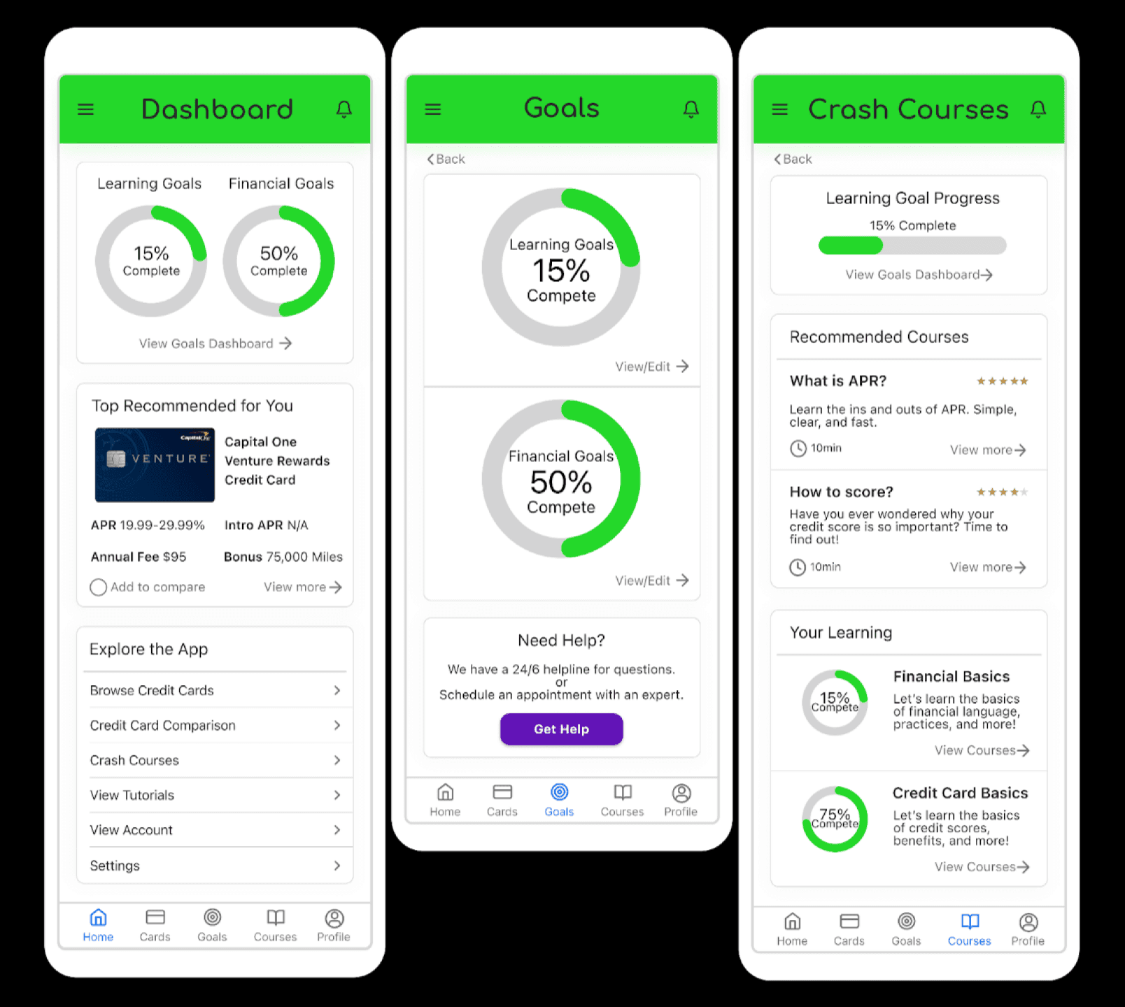
Later iterations and Usability Testing: Round 1
Iterations and the second round of usability testing
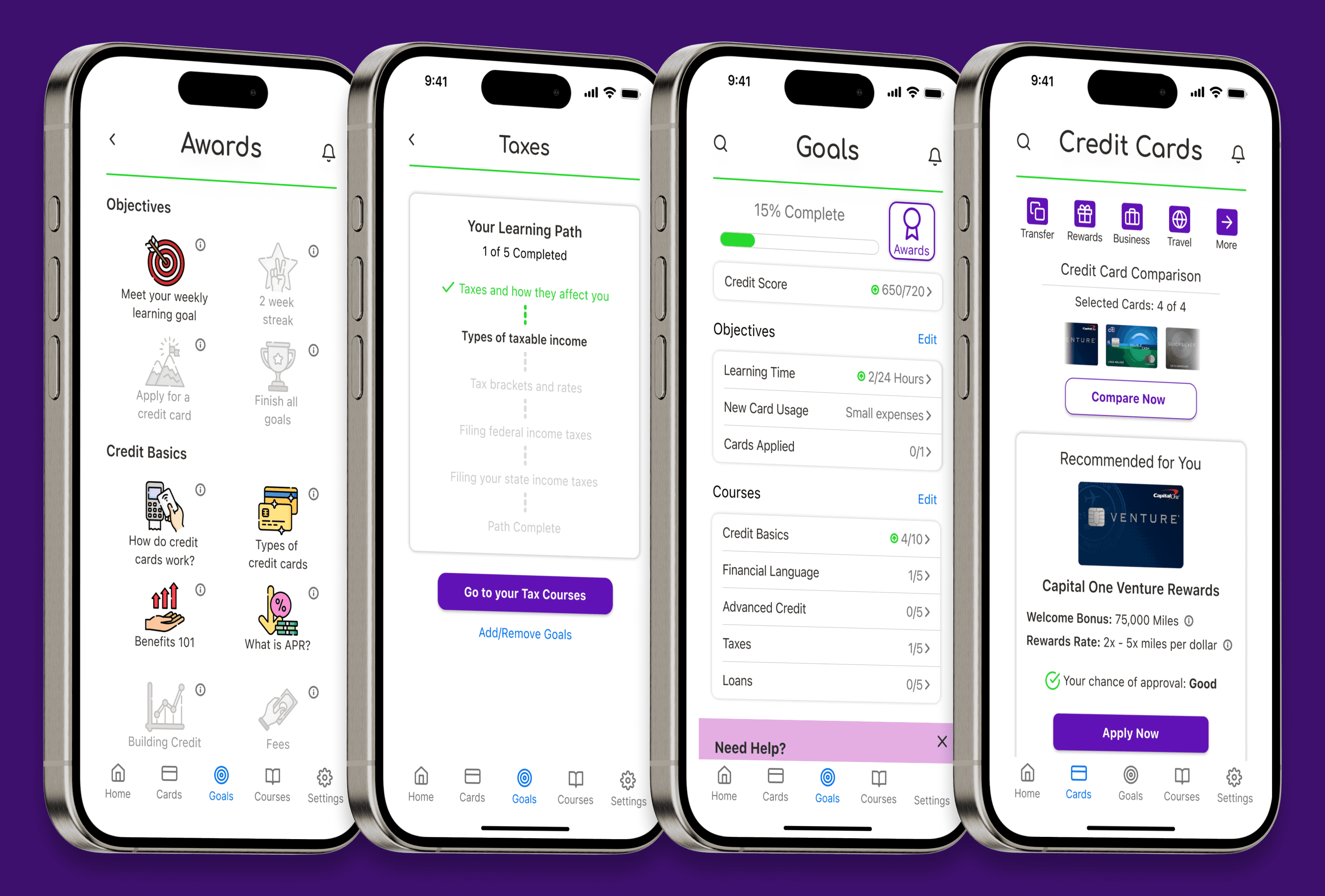
Creditquest simplifies the process of finding a credit card while educating you about healthy credit habits, financial terms, and important know-hows. Let Creditquest help you make informed decisions, so you’re not left guessing about whether or not the credit card you have is the right fit.
Take total control over your journey to find the perfect credit card. Choose what you see by completing CreditQuest’s easy configuration. Once completed, CreditQuest will get right to work on bringing you the most personalized recommendations possible.
Creditquest makes comparing potential credit cards simple, offering a detailed and customizable comparison feature. Save time by choosing the information you want to see and compare, all within the tool itself.
Journey alongside the app by interacting with your customizable goal paths. Allow Creditquest to path them for you, or create your own maps to explore and discover your way.
Leave your confusion behind by traveling through a new and unique approach to learning. CreditQuest’s interactive crash courses are short and simple so that you can use your time your way.
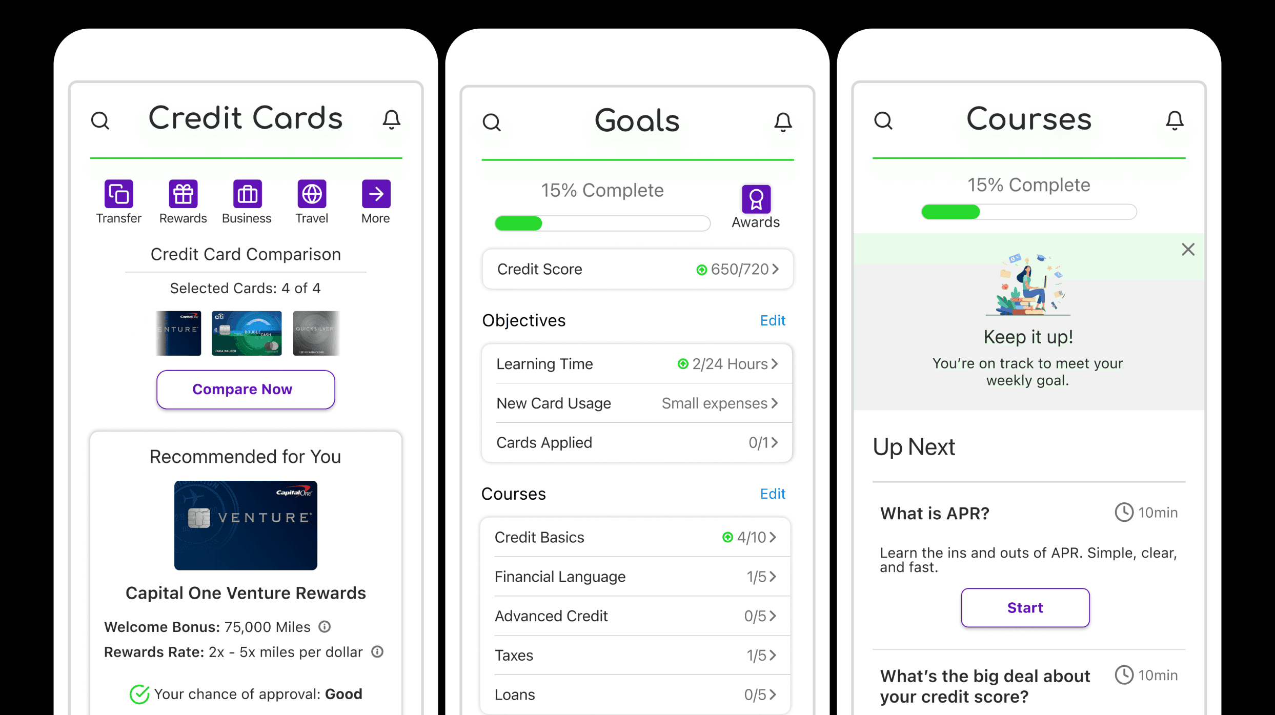
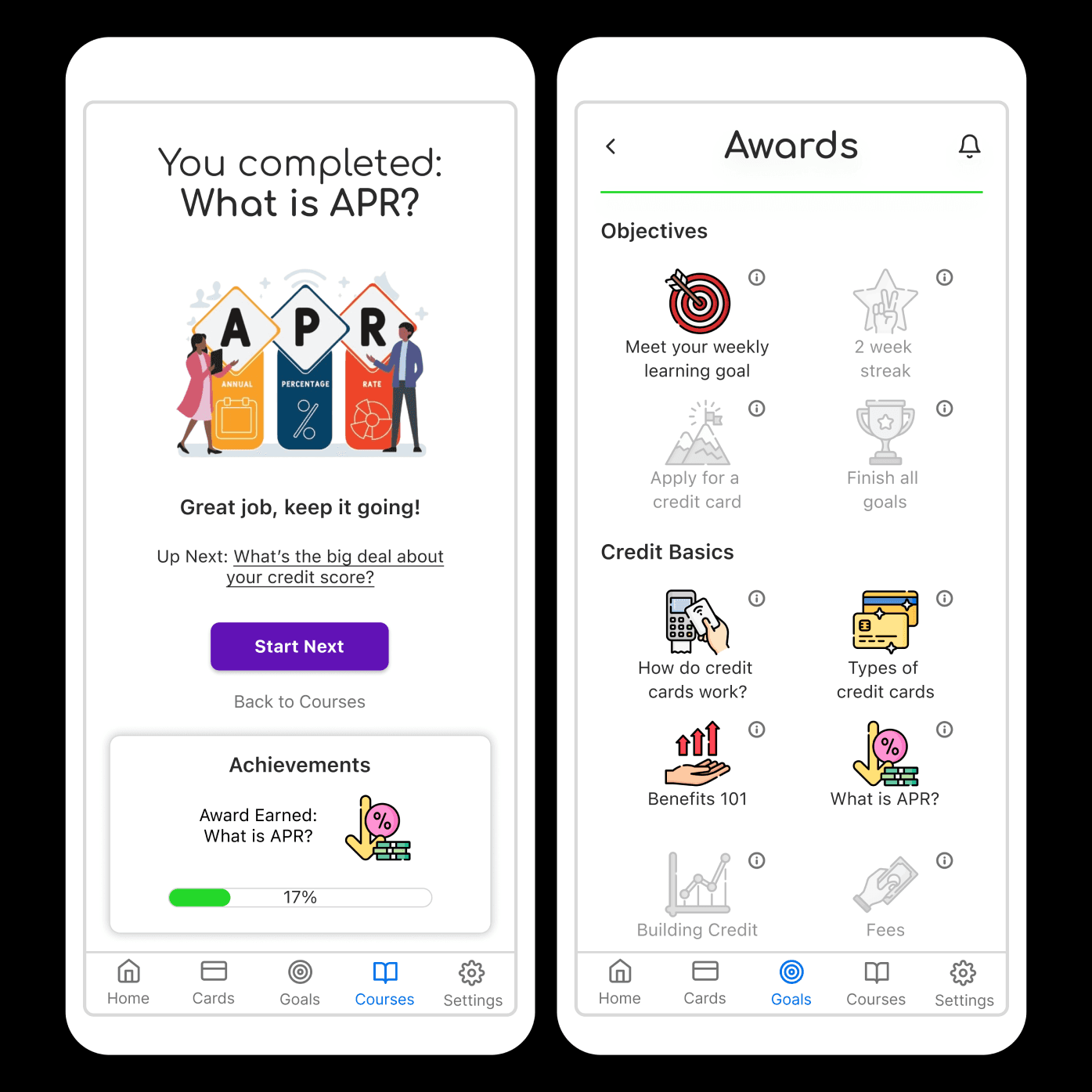
Based on feedback in the usability testing, I wanted the app to more clearly incentivize users into coming back to the app. I decided to work in a gamified spin that goes hand in hand with the goals and crash courses.
Introducing: User Progress
Each time a user completes a crash course or a task from their goals paths, their achievements will be displayed. The user will receive a congratulatory message, where they will be able to see their overall progress bar tick upwards. They will also receive an award and its corresponding badge, both of which can be viewed via the Awards page in the goals section of the app.
The potential of an app like CreditQuest to take off in today’s market is unknown because, as far as I’ve been able to research, nothing quite like it has been developed before. Though the layout and function of the app is mostly formulaic, the different take on some of the features and the addition of making knowledge acquiring a sort of game sets it apart. In theory, these inclusions could lead to better user retention. Instead of being the usual one and done, CreditQuest could maintain a more steady user base.
Based on user feedback on the experience with CreditQuest
Let's talk!
cassiehonasdesigns@gmail.com