Let's get groovy: Groovel
Music is everywhere, in the home, in the stores, at the parks, and this constant exposure makes it feel like a very normalized part of everyday life. With the rise of music streaming, people have the playlist to their days at their fingertips whenever they want. In that way, customizability and discoverability have become essential to the listening experience. So what makes people want to pay for these services vs using the free tier?
Scope
90 Hour time constraint
Task: Increase revenue by adding free to premium conversion routes
Target audience: 18-24 year old tech savvy, budget conscious, who sees music as a huge part of their lives
UX/UI Designer
Worked through the UX process:
Research
Ideation
Design
Validation
Iterations
My Role
1. Context is key
To kick off the research portion of this project, I dove headfirst into comparing, studying, and analyzing three industry leaders within the music streaming world. I choose to look into three apps: Spotify, Youtube Music, and Pandora. I chose these apps because they were suggested by the company, but over the course of the project I also looked into other apps such as Apple Music and Tidal.
Competitor 1: Spotify
Inquiry
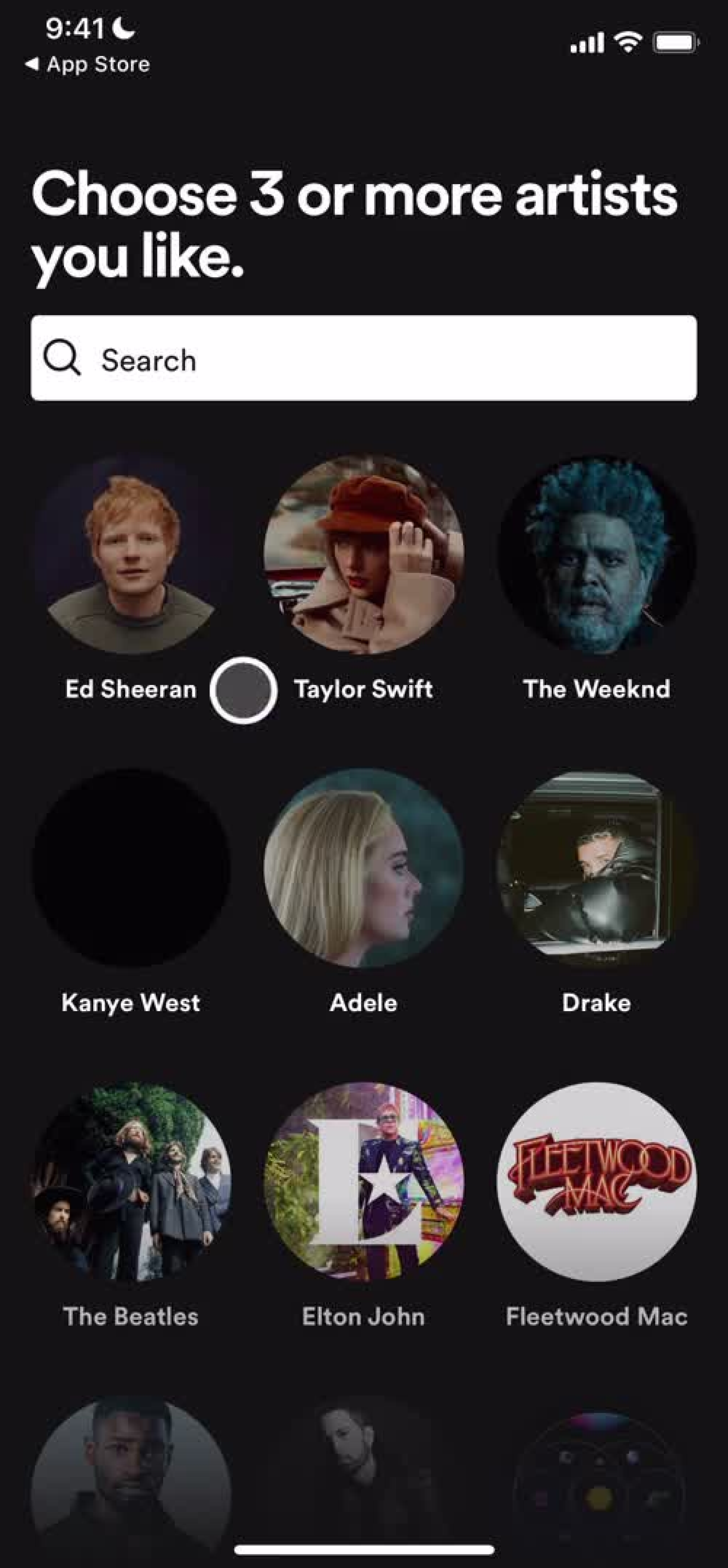
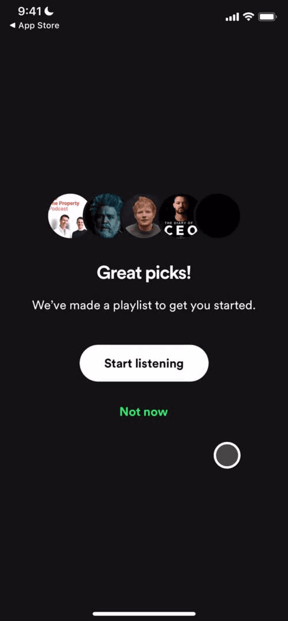
Is it worth putting the call to action in the onboarding process?
Takeaways
I was questioning whether or not it was a good idea to put the upgrade prompt in the onboarding flow. Spotify introduced the app and its free features before presenting a paywall that might stop the initial listening experience.
Competitor 2: Youtube Music
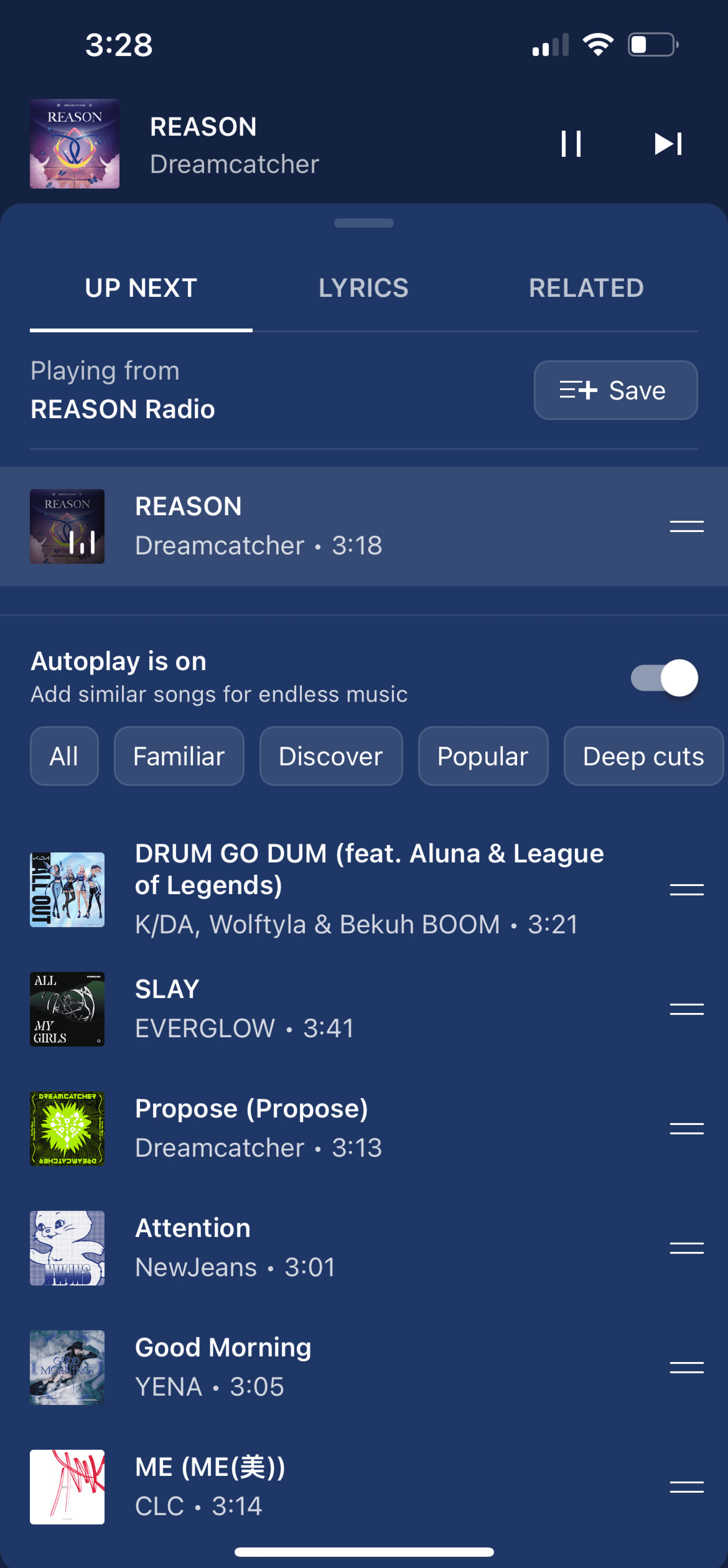
Inquiry: Looking at Youtube Music
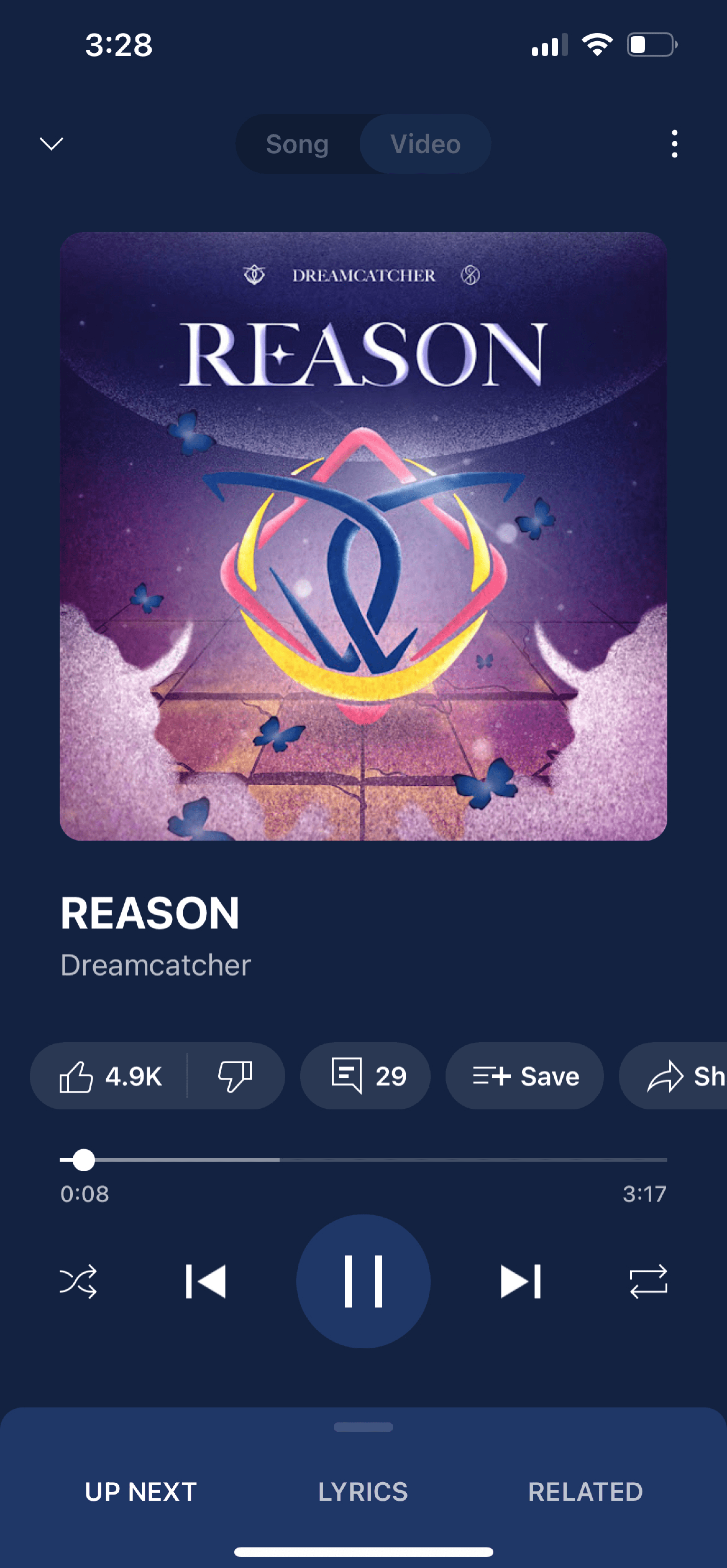
How can an app have good functionality while also maintaining a clean, balanced look?
Takeaways
One thing I noticed in particular was how cluttered YouTube Music’s UI was at times. Though familiar because it uses the same icons and buttons as YouTube, in practice the UI felt very cluttered and busy.
Competitor 3: Pandora
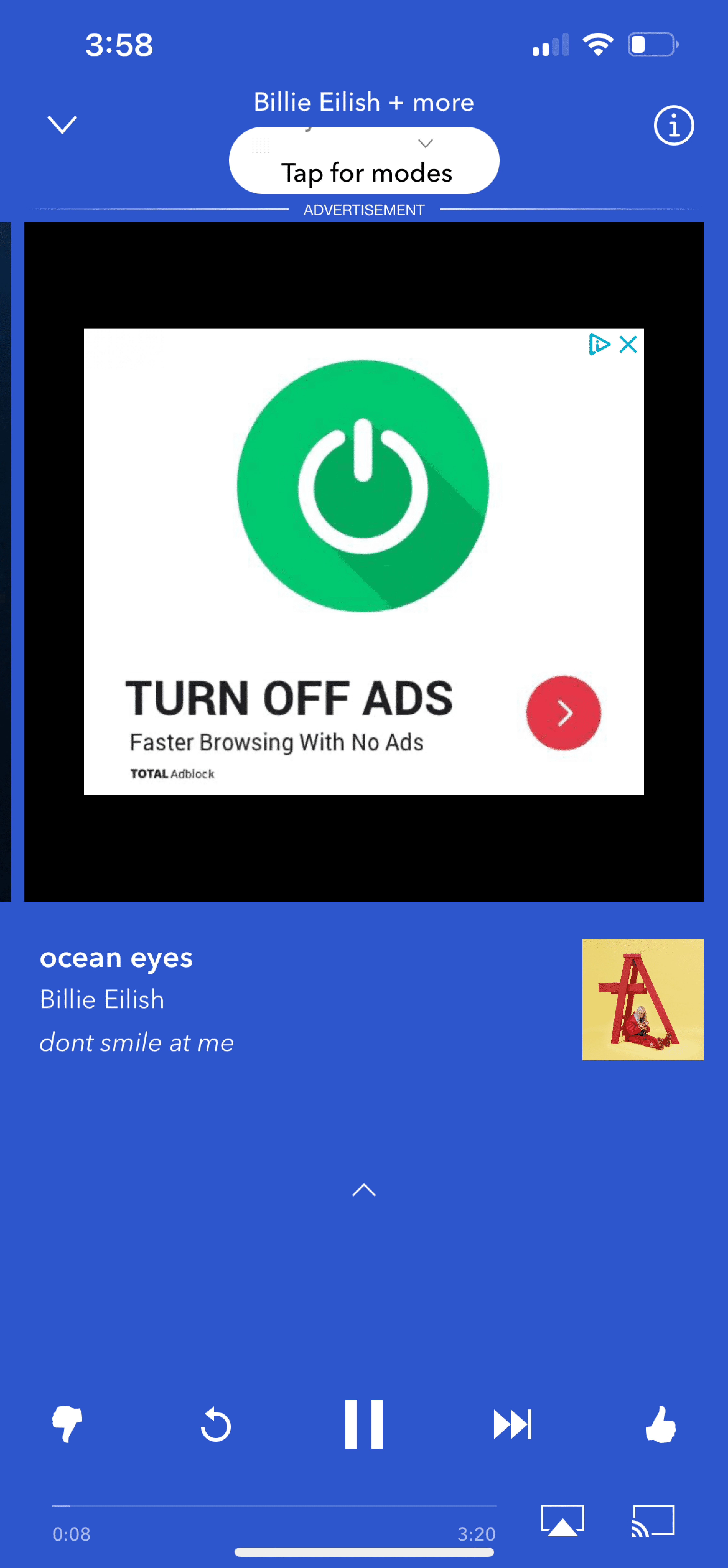
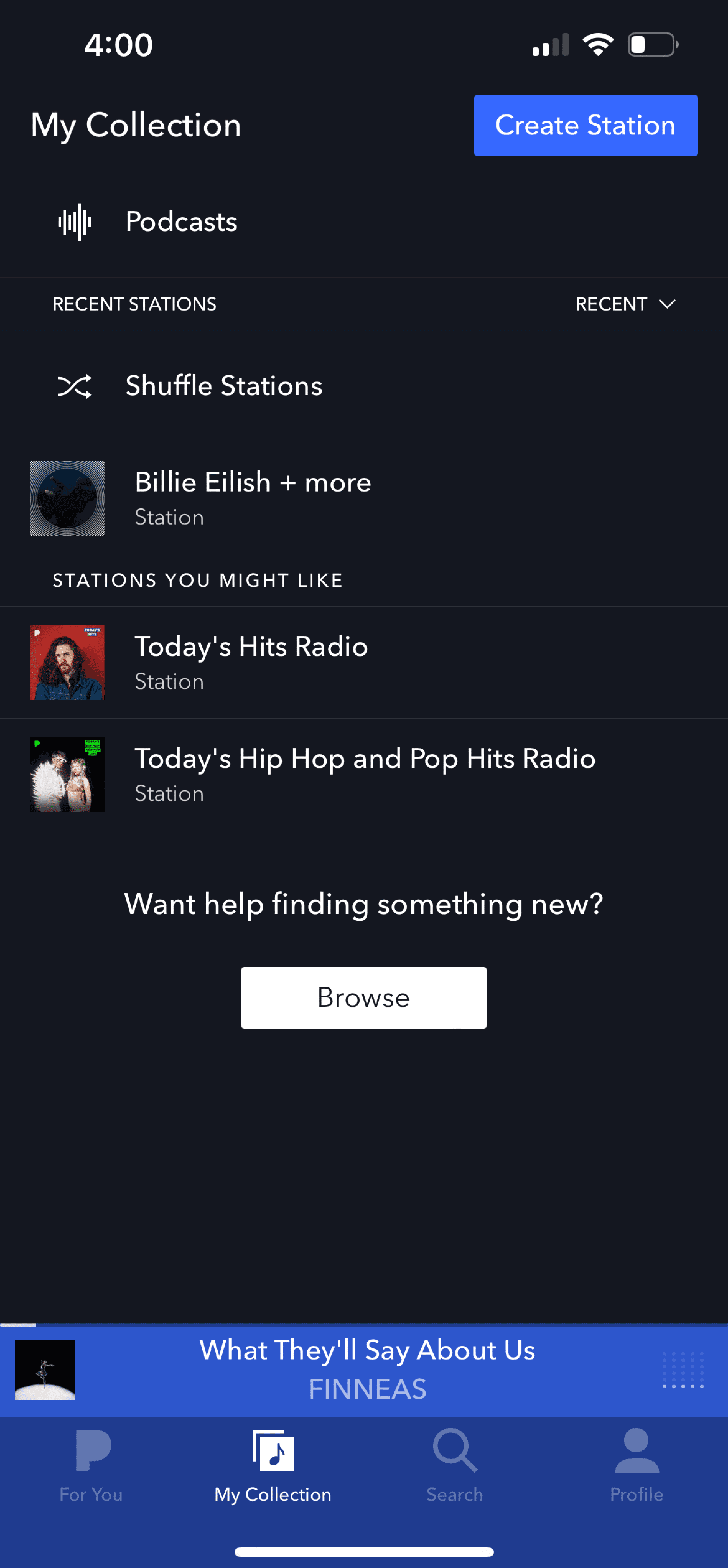
Inquiry
How can you implement a sense of discoverability while still maintaining user control?
Takeaways
Users like when an app helps them discover new music with minimal work.
The main thing Pandora lacks is an innate sense of user control.
Taking aim: how to find the target
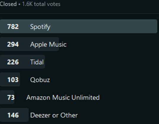
The overall consensus concluded that Spotify is the best music streaming service in the industry to date because it has:
Top notch discoverability
Most expansive features offered
Best price
Best free tier
Best music catalog
Secondary priorities people mentioned included:
Customization features
Quality of sound
Ease of access
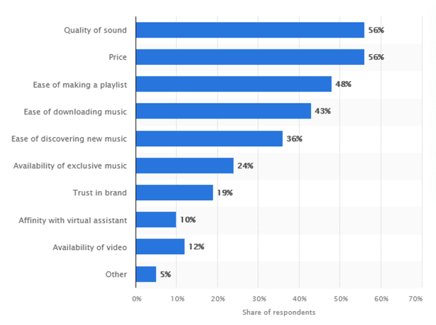
When asked what their favorite streaming services could improve on, users suggested:
The addition of a social side of the service
Better customization
2. Starting from Scratch
I knew that I would not have time to create every single feature due to time constraints. I decided to focus on how a user would interact with Groovel to meet the company’s goal for premium conversion.
I was provided with 5 basic wireframes to base my designs on:
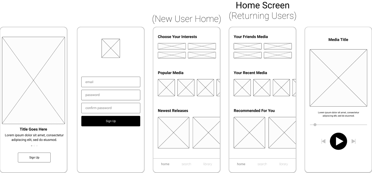
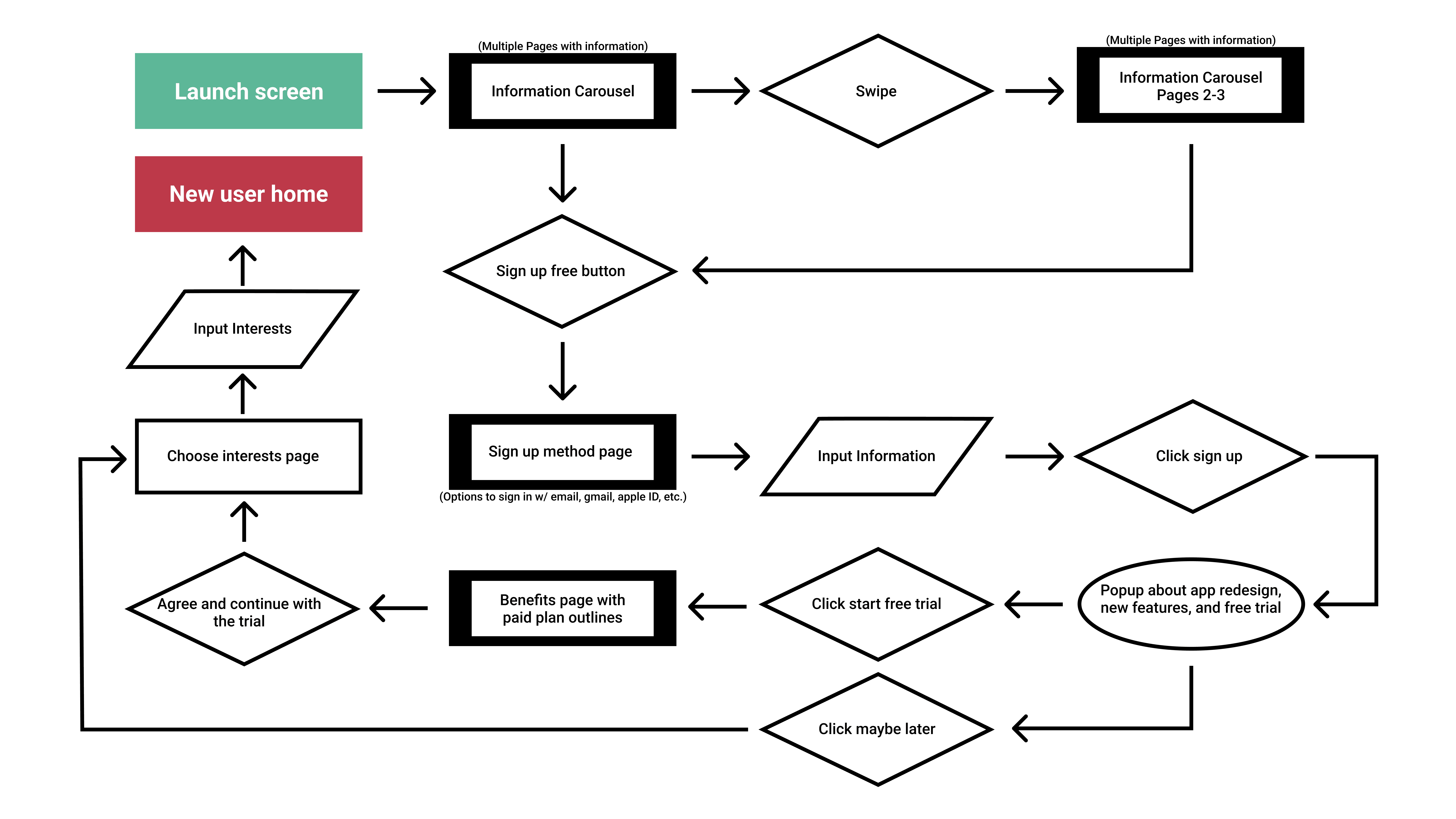
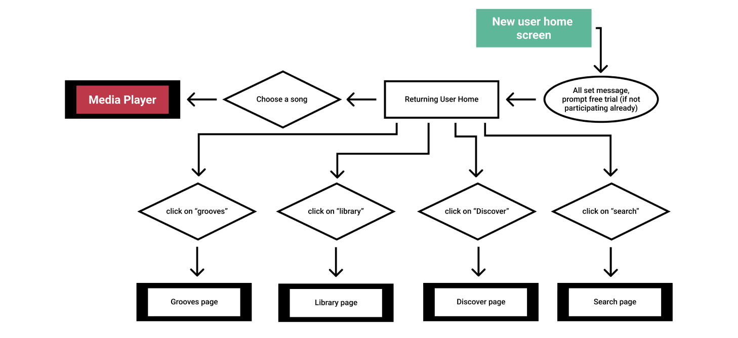
The following user flows grew and evolved during the entirety of the design phase, with a few of the original pages being excluded, moved, or reworked completely. However, I started here based on the understanding I possessed from the initial research, the project brief, and hands on experience with competitor’s apps.
Conceptualizing the content
I decided to design to the angle of Groovel going through a rebranding, which shaped the story of the app’s narrative and my approach to certain interactions.
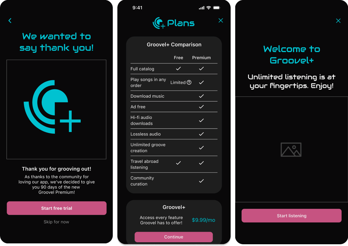
I’d like to point out that despite observations made during the research phase, I decided to include a premium upgrade prompt within the onboarding flow. Even though users do tend to skip through introductory screens and offers, I deemed it necessary to include the prompt here for those who do try free trials right away. By providing easy access, the chance for a better conversion rate increases.
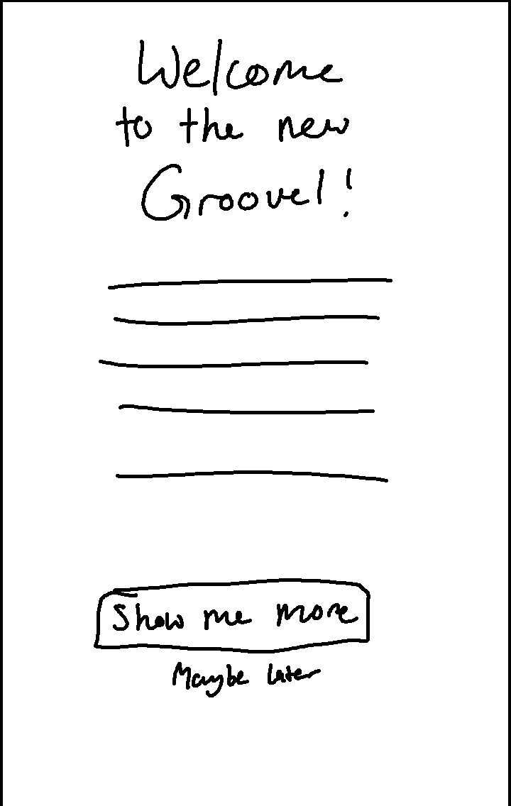
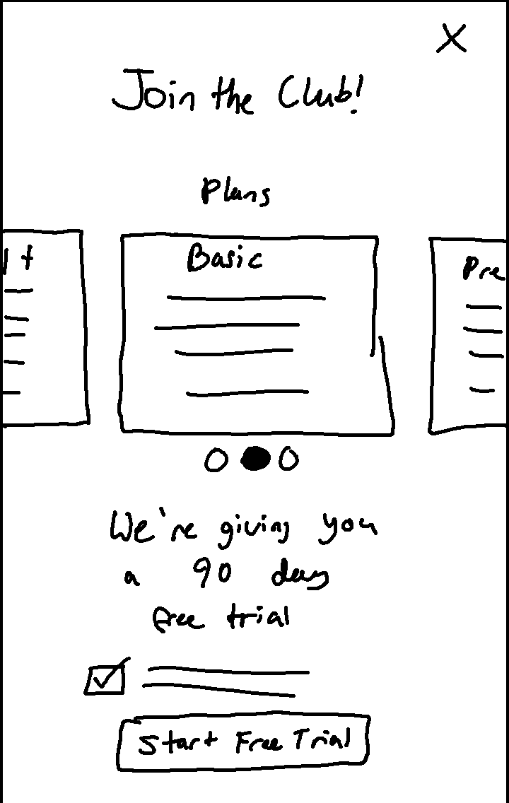
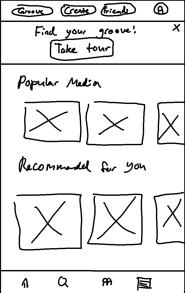
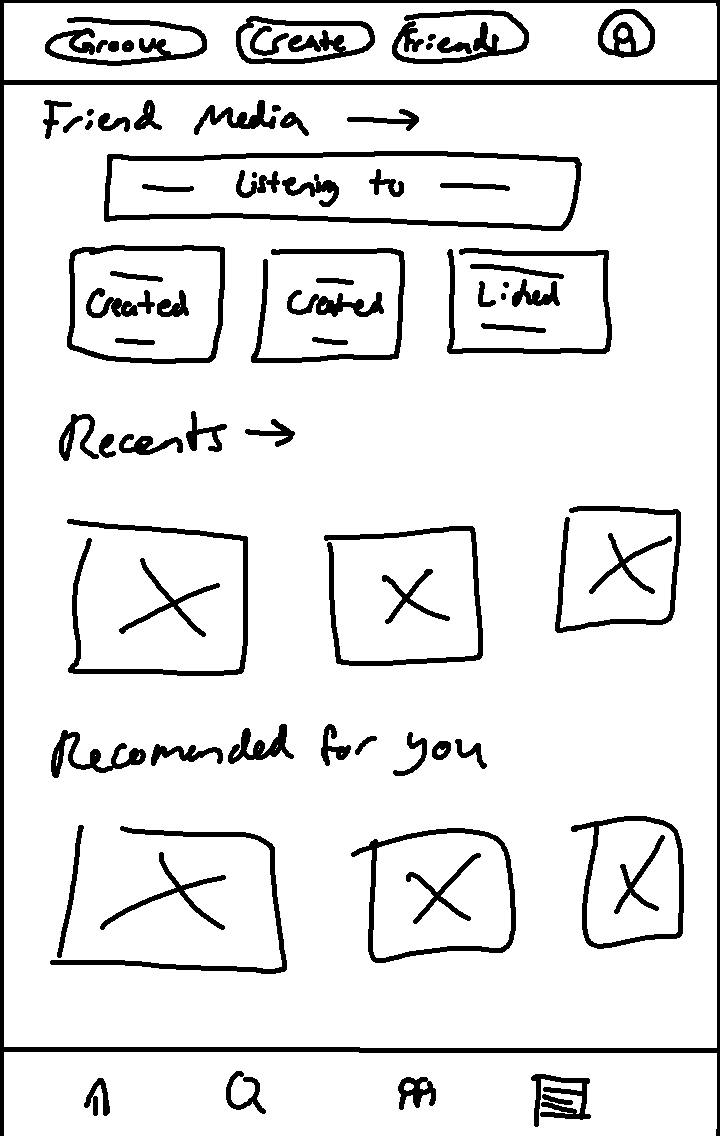
I only sketched out the main screens that I deemed important to the red routes of this project. I struggled with how to include the “your friends media” elements from the brief. Even though I included these elements here, I knew that this layout wouldn’t go past this iteration. I already had a few other ideas cooking in my head, which would eventually manifest in the form of designated community features.
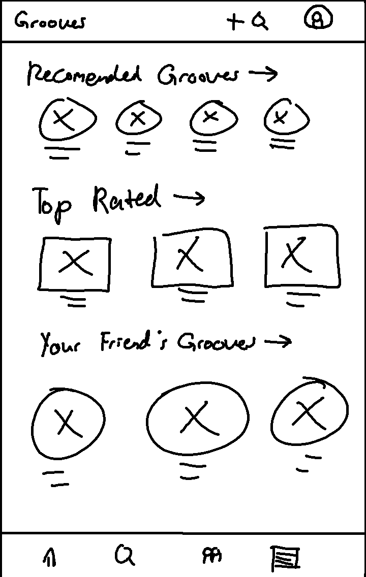
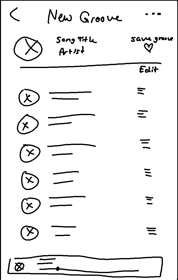
Introducing the new features
Groovel’s main aim is to draw paid users into their user base, therefore I had to decide which distinguishing features would separate the free tier and the brand new premium tier. The differences had to be enticing enough for users to want to at least try the paid tier out, to hopefully establish the habits needed for them to keep paying once the trial ends. I eventually settled on the comparison chart featured below.
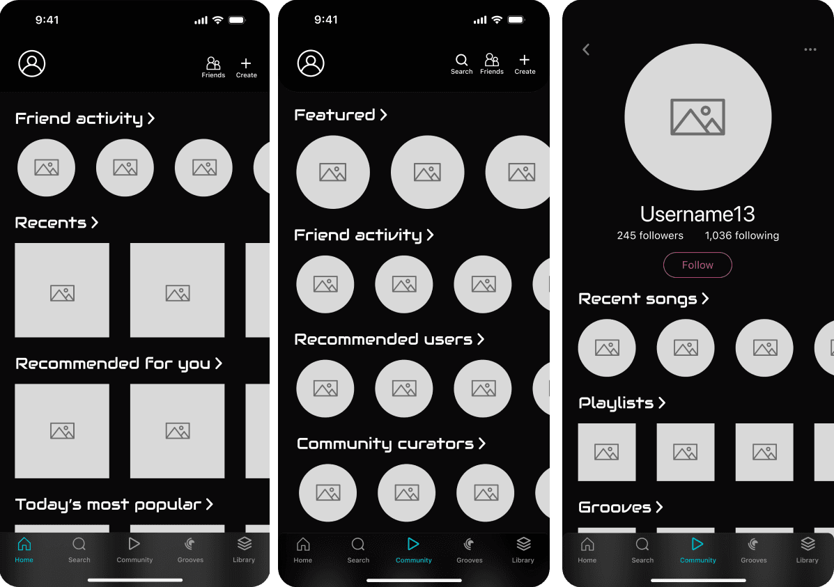
I wanted to implement community features. This would include friend activity feeds, a community tab accessed from the bottom toolbar, and user profiles/discoverability. The ideas behind the community tools lean into discoverability.
What is a groove?
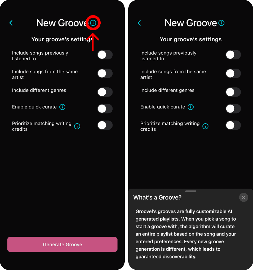
Finally, I fleshed out the new groove feature and the first draft of how the groove creation flow might work. I knew there was a lot of room for improvement in the flow and designs of this process, so I was excited to present it during the usability tests to get user feedback.
There are five easy steps to making a Groove:
Pick a song
Choose your settings
AI generates a playlist
Save or reroll the playlist
Enjoy!
What did the people think?
Overall the first round of usability testing went by smoothly. The tests took place online with the participants sharing their screens so that I was able to follow along with their progress. All five participants were able to navigate the app without too much trouble, with several stating that it felt very intuitive even in the low fidelity state. The participants liked the groove feature and they also approved of the community features, which allowed me to feel confident including them in later iterations.
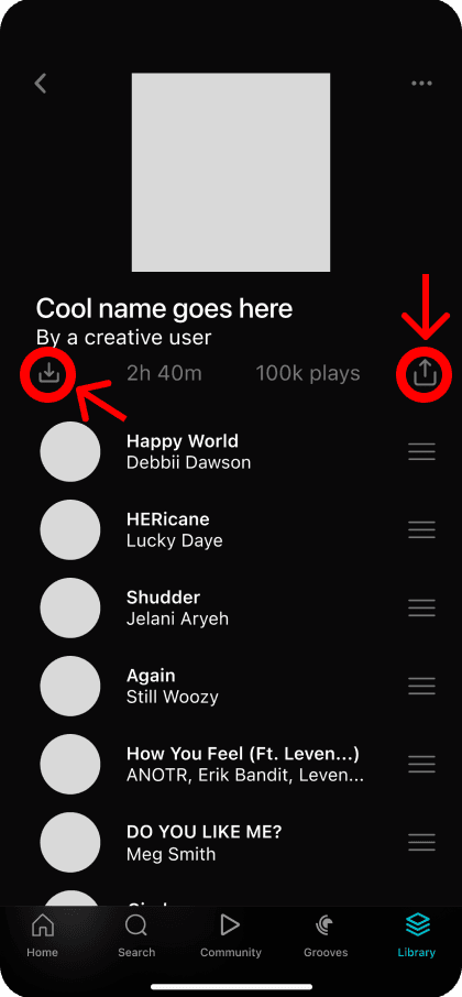
The other issues to note were general mistakes and confusion around the iconography, with 4 of 5 participants mistaking several buttons for other meanings. As an example, the icon I had intended to represent “save playlist” was seen as a download to device button by all of the participants instead. This ensured that in the next iteration, I would be even more intentional with the iconography used.
3. Stepping it up - High Fidelity
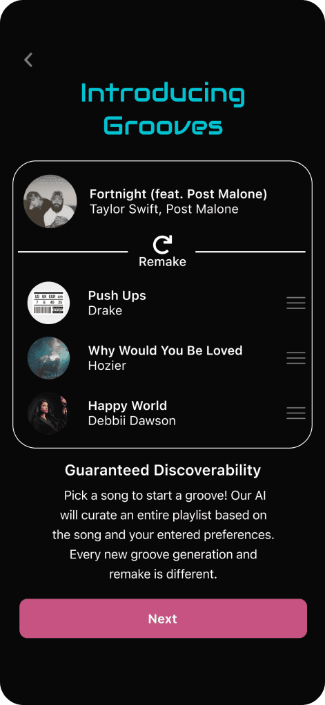
When I stepped into the high fidelity design mindset, I prioritized fixing the issues found during the usability tests first, and the rest of the stylization second. If I wanted people to know about grooves before they started navigating the app, I decided I needed to add an explanation during the onboarding process.
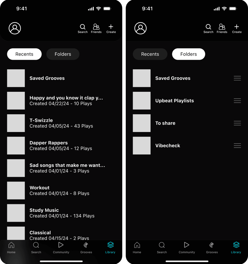
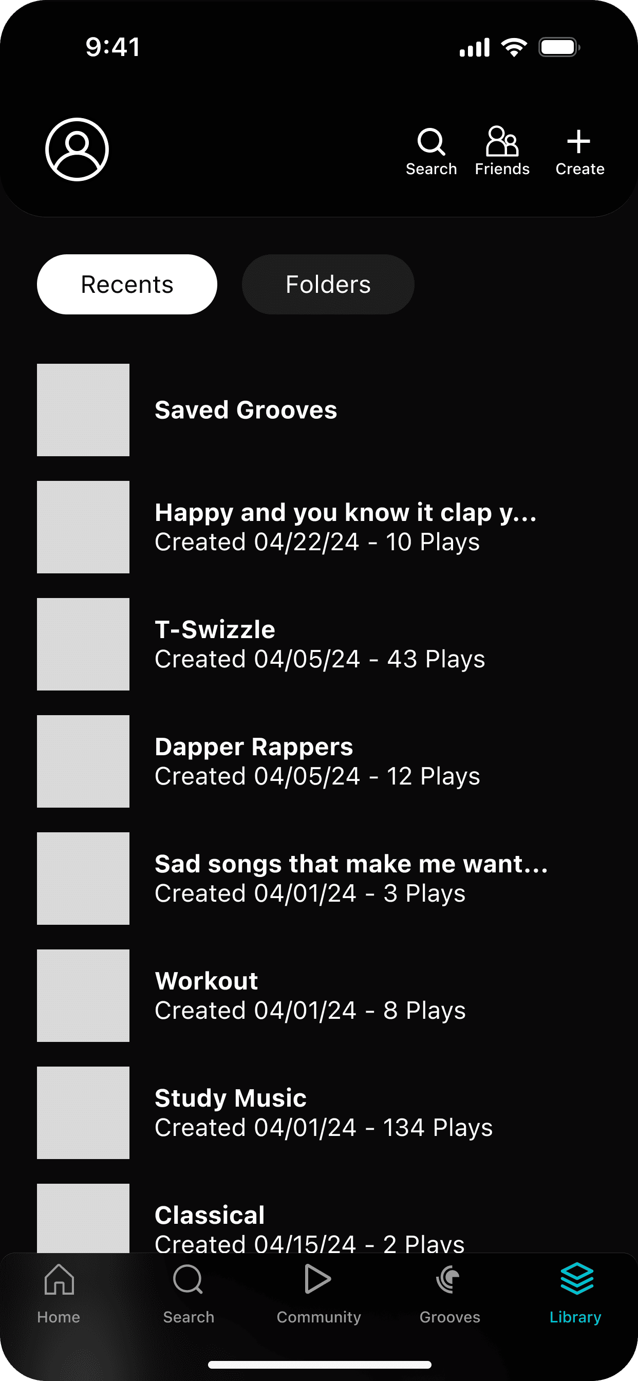
I also changed the “Recents” tab to be the “Playlists” tab to clear up any confusion about what the page contained. The final quality of life addition to the playlist page specifically was the filter button which would allow the user to change the order in which the playlists are seen. For example, by recent activity, most listens, newest, etc. This allows more user control and flexibility to find the playlist they were looking for, while also leaving fewer questions about how the playlists were organized.
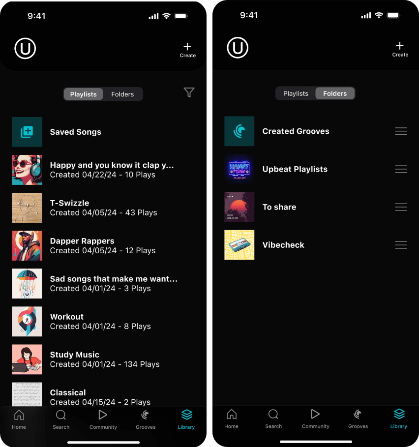
Next I zeroed in on improving the groove creation flow. I had received feedback that it felt a bit cluttered and busy, so I aimed to break up the process and add a few key screens to flesh out the feature more clearly.
One interaction to note in this iteration is that the “friends” button in the top toolbar of the main screens takes the user to their friend’s activity page. There was no way to access your friends list in this iteration of Groovel.
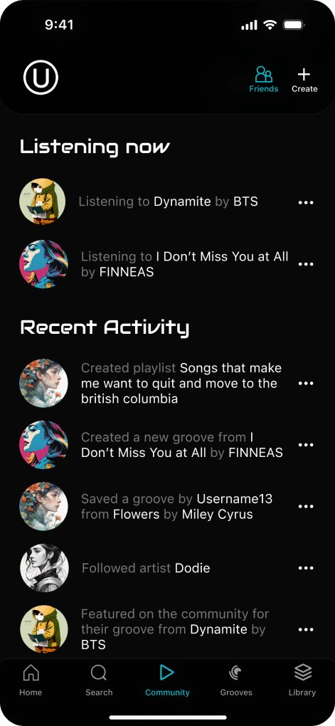
And the people say...?
The second round of usability testing also went very smoothly. The participants liked the feature flows, and expressed interest in how they may look in the future.
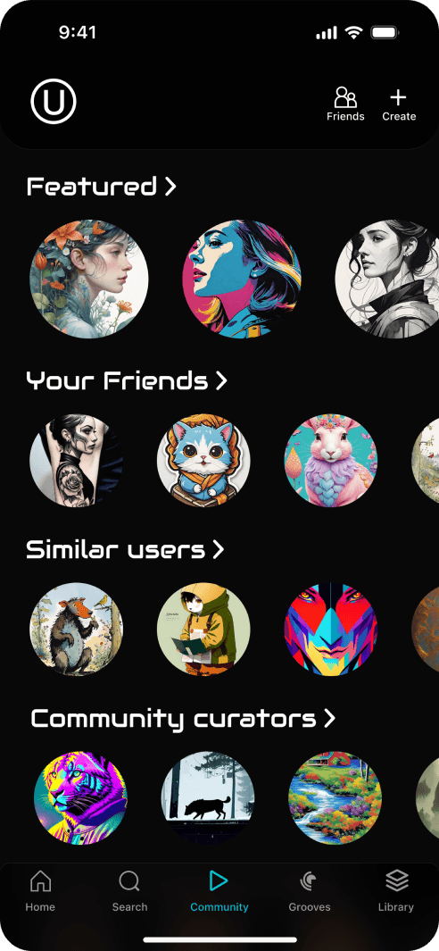
Users expressed a desire to search for specific things throughout the different screens/features. Visually, users pointed out the inconsistency in the shapes of the album covers on the user homepage, the inconsistency of the layouts/UI of the playlist vs groove pages.
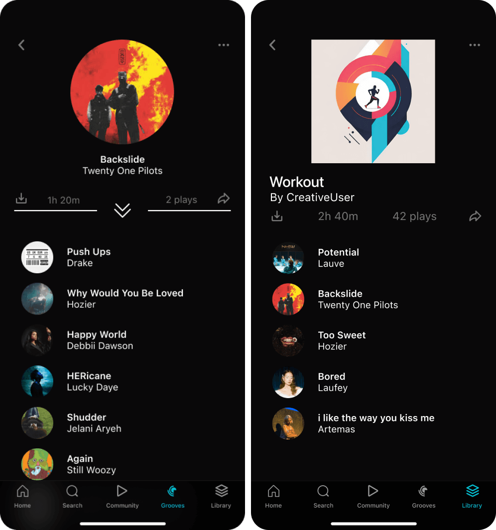
Let’s talk iterations
Before I dive into the final designs, I wanted to make a note of a few scrapped ideas and a few quality of life changes that happened between the usability tests and the end of the project.
In an effort to stylize and improve the community pages, I opted to try out a carousel element to showcase the different categories across the featured and discover tabs. I quickly scrapped that idea because the accessibility of a design like that is abysmal, especially for those who utilize screen readers.
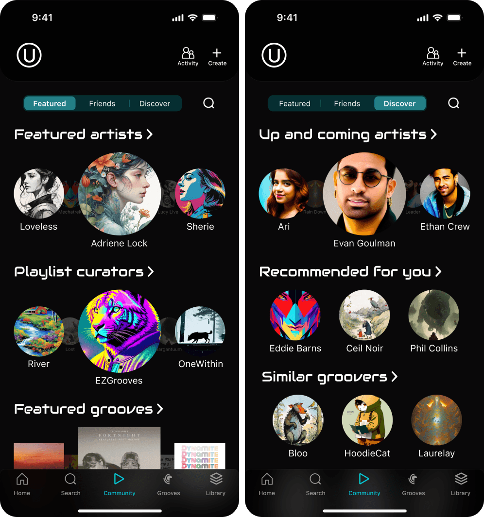
Due to user feedback, I also took a second look at the information architecture and concluded that the “create” button in the top tool bar did not make sense. The user profile image in the top left and the activity button in the top right both sent the user to completely different pages, whereas the create button merely opened an options menu.
I did take one more look at the library page. I wanted to ensure that the visual hierarchy was consistent and correct, moving elements like the filter dropdown to a location that made more sense.
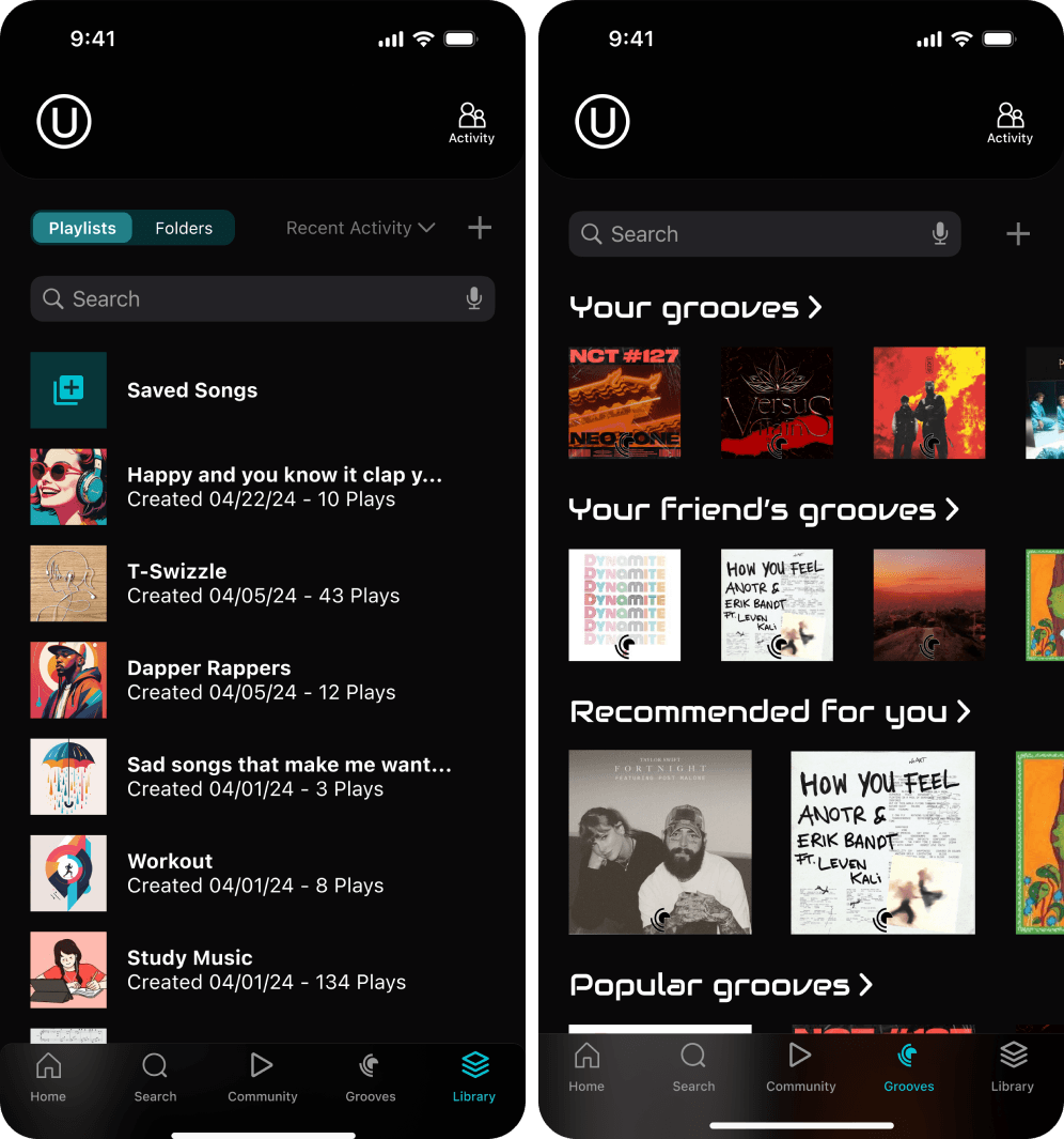
4. The final designs: Groovel in review
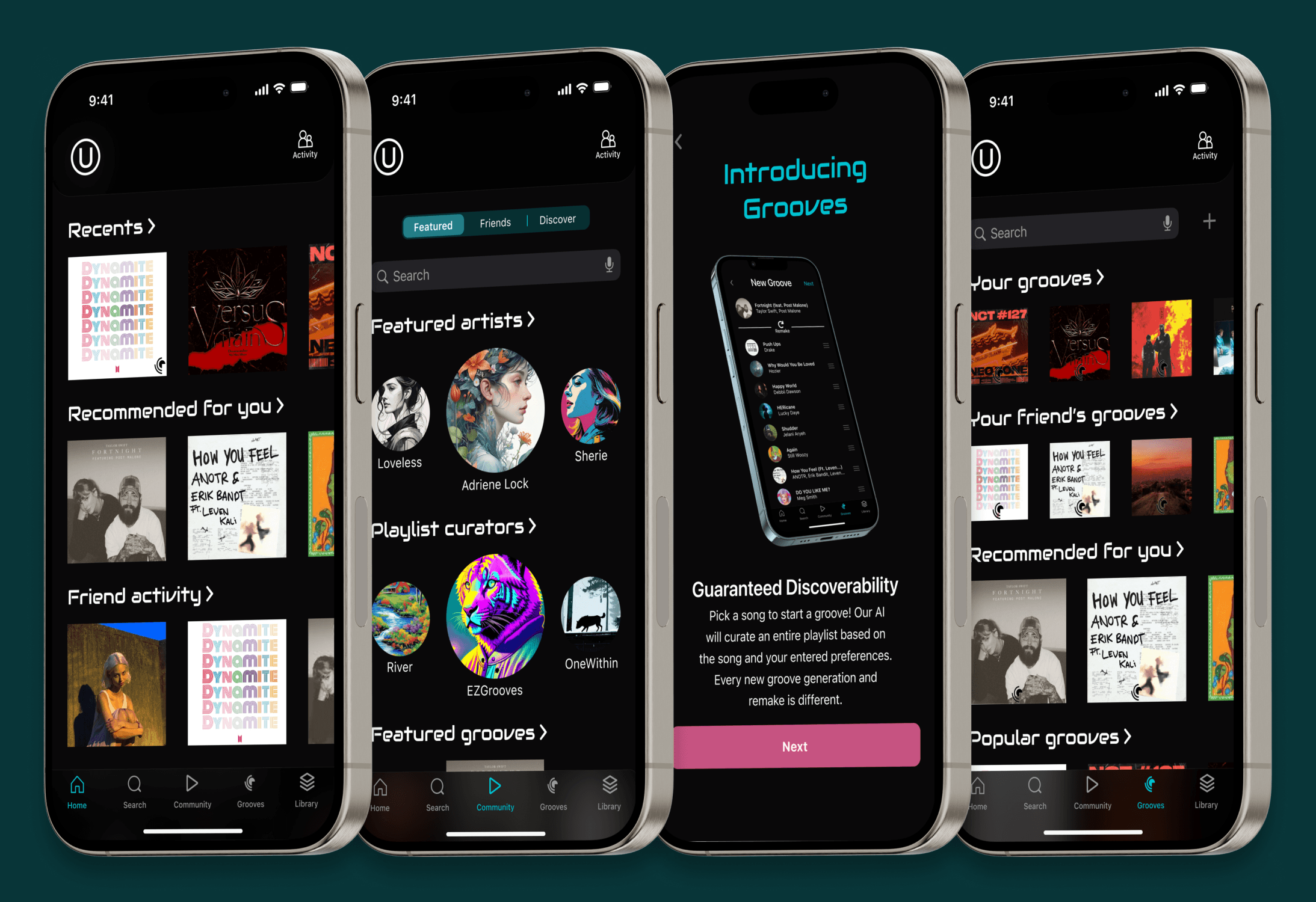
Introducing the new and improved Groovel. Listen to millions of songs, connect with other groovers, and discover your next favorite groove through the improved discovery features.
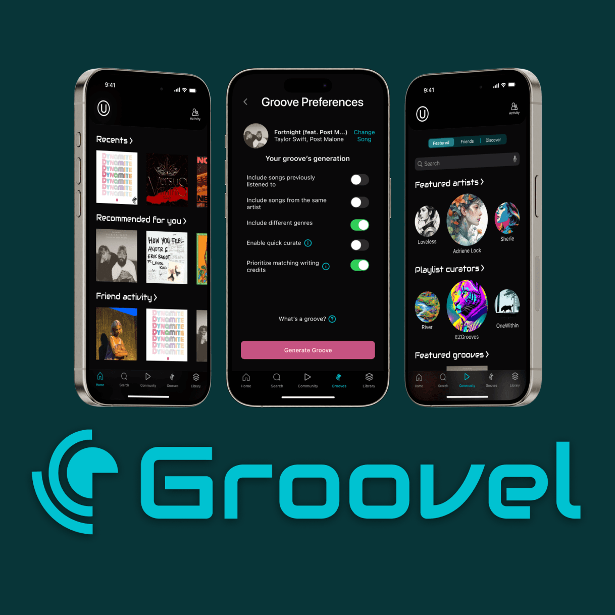
Discoverability your way
The newest and most exciting feature this rebrand has to offer allows you to take a song and create an entirely new playlist based on your preferences via our state of the art AI curation algorithm. Don’t like the songs you pulled? Simply press remake until the songs suit your taste, edit the groove details, and save! This feature guarantees music discoverability and full playlist customization. Get to groovin’ today and find your next favorite song!
Make groovy connections
Explore the new community features, which make connecting with kindred music spirits a breeze. Find new artists, follow community endorsed playlist curators, connect with groovers with similar music tastes all over the world, and see what songs others recommend. Within the activity page, see what your friends are up to and what they’re in to at a glance. Explore together, listen together, create together.
Organize and listen
Groovel makes organizing your library as easy as 1, 2, 3! Filter your playlists, organize them into playlists, and see which ones you listen to the most. Download individual songs or entire playlists for offline listening to enjoy hi resolution audio anywhere.
Introducing Groovel+
To match the demand for our streaming services, a premium plan has been released for those who want to up their listening game. Choose the plan that works best for you with individual, family, and student pricing. Access unlimited groove creation, the best audio quality, song and playlist downloads, and more! Want to try our most groovy features before you pay for them? We’ve got you covered with 90 days of Groovel+ completely free of charge.
5. Wrap up and closing thoughts
Groovel, though familiar and within the realm of apps that have been researched into and created before, has the potential to be very successful in today’s market. With the rise of AI tools and inclusion, implementing AI curation based on user input is a fresh concept that has so many angles to take into account. I believe that the groove feature is what sets this app apart from its competitors the most. So, how did this project align with the pre established project goals?
Standout Quotes
“I like that it [groove generation] does the work for you.”
“It’s a really cool idea to get AI involved in it [the app], I love it when people generate playlists for me.”
“Free things [free trial] are always nice, especially if I know it’s something I’m going to be using”
“It [the app experience] allows you to be more involved while finding new music.”
Looking at the numbers
100% of users liked the Groove feature
50% of users would try the free trial off the onboarding flow
70% of users would subscribe to Grovel+
Overall, this project can be deemed a success based on the company’s needs, user feedback, and overall acceptance of features and free to premium conversion potential.
Let's talk!
cassiehonasdesigns@gmail.com