Finding your next best friend: CityPups
Finding the perfect dog to bring into a family has always been challenging. Which dog has the best personality and disposition, which one will fit your space, which one will get along the best with all the members of the household, is the dog close by?
Scope
1 week design sprint
Task: Find, design, and test a website solution.
Target audience: potential pet owners who live in larger cities
UX/UI Designer
Worked through the UX process:
Research
Ideation
Design
Validation
Iterations
My Role

1. Research to make the blueprint
User interviews revealed that people in larger cities worried about:
The size of their home
Their working schedule
How much time they’d be able to dedicate to the dog
How well the dog would do in crowds and busy transportation hubs.
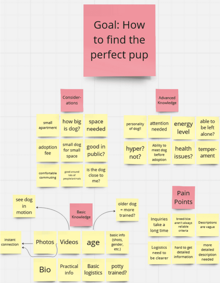
I concluded that people want a simple way to search and filter through all of their options in order to view:
The dog's information and history
Media about the animal
The adoption organization’s contact information for each dog.
How might we…
Help people find the perfect dog for their busy city homes?
Encourage connections between the person and the dog they want to adopt through their screen?
2. Competitive research, quick ideations, and the initial solution sketches
I dove into researching how other people had addressed this problem space before myself. I used the Lightning Demo technique to gather ideas from four websites: Petfinder, Beauties and Beasts, Crunchyroll, and Fiverr.
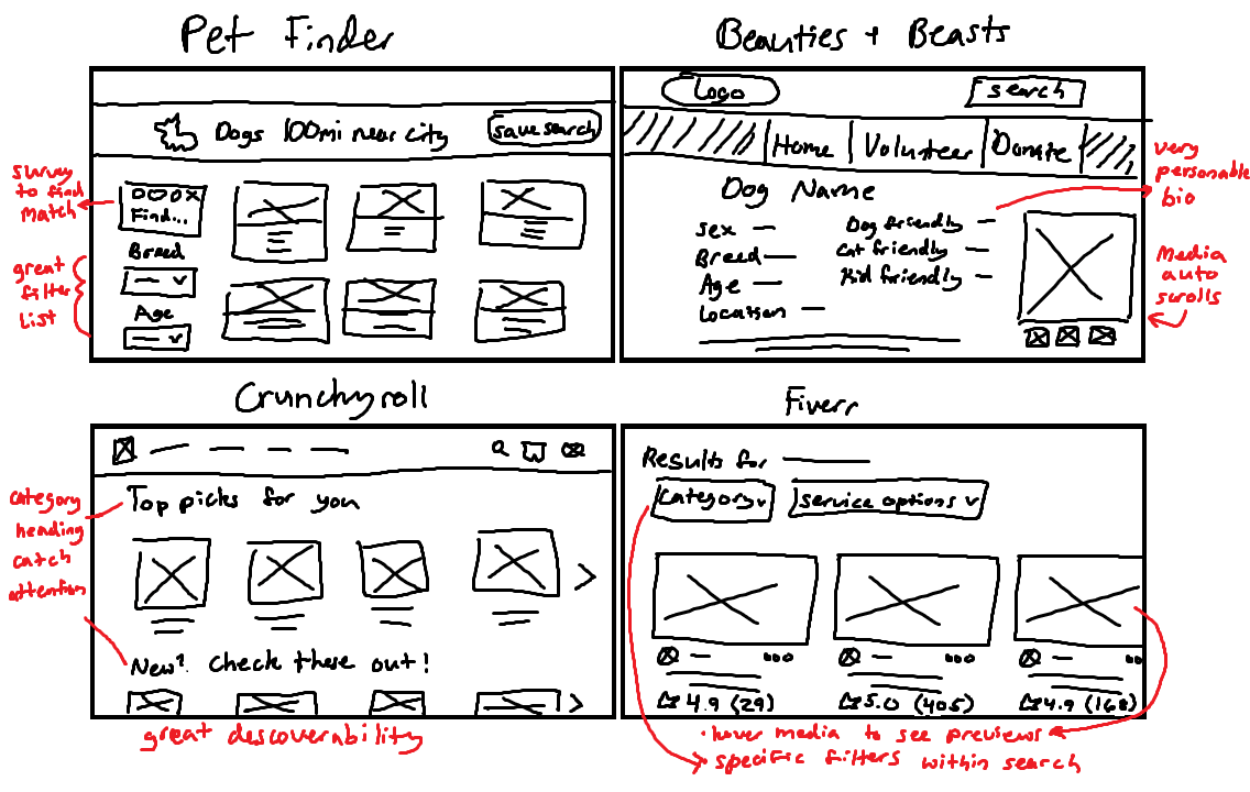
Quick Brainstorming
For this brainstorming session, I focused on both the main catalog screen and the main dog bio screen because both are extremely critical to the operation of a website of this nature.
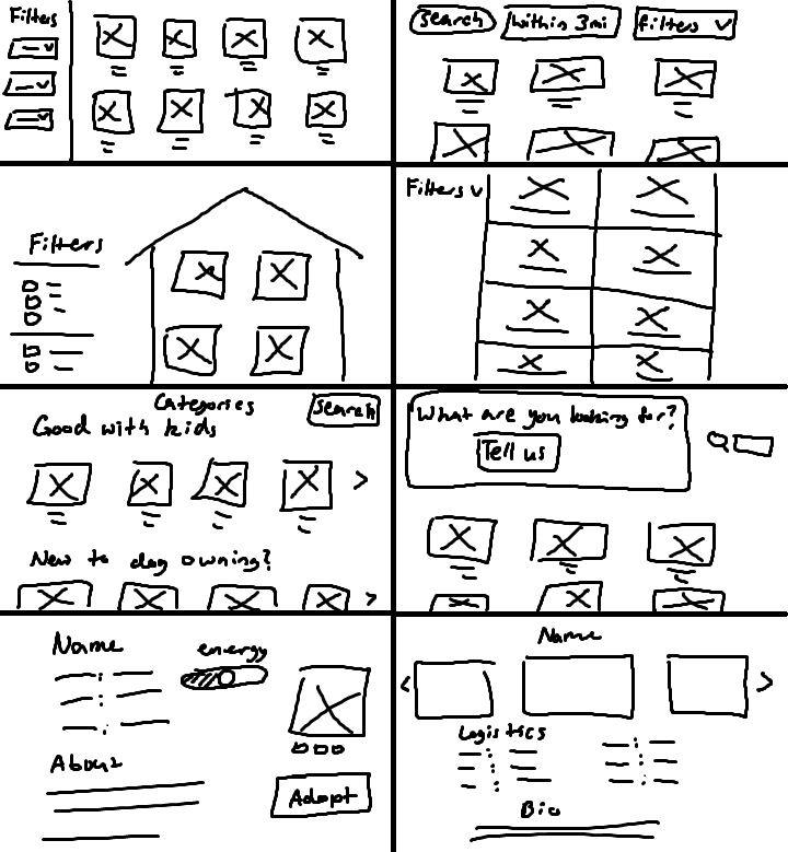
Solution Sketches
I set to work drafting the rough sketches for the most important pages. Starting with the landing page:
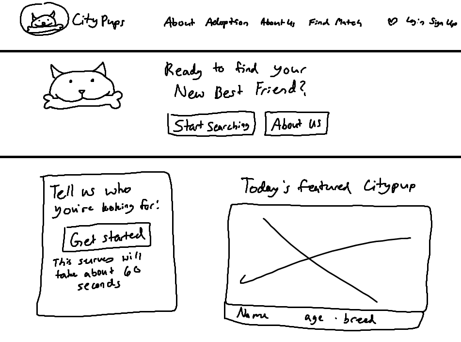
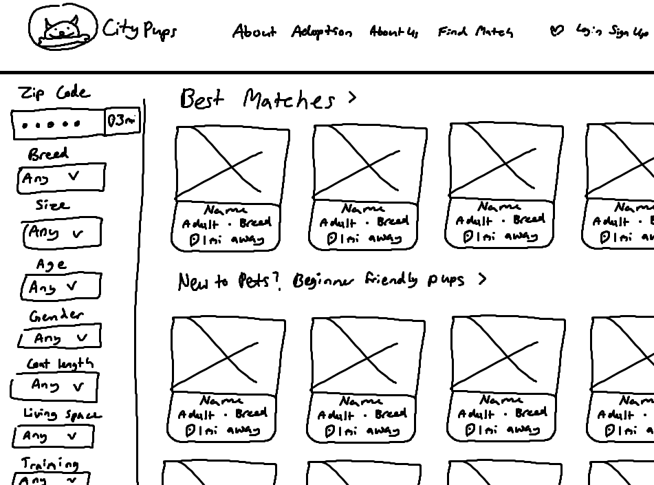
The catalog had to have a few specific features:
Filter list (including geographic filter)
Good discoverability (carousel categories)
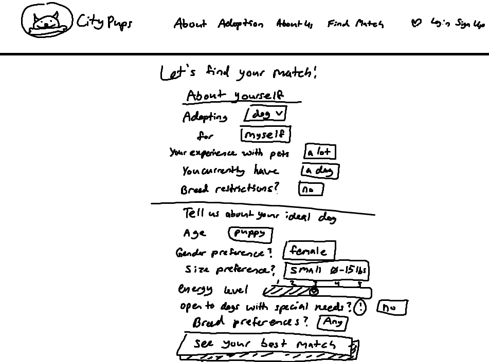
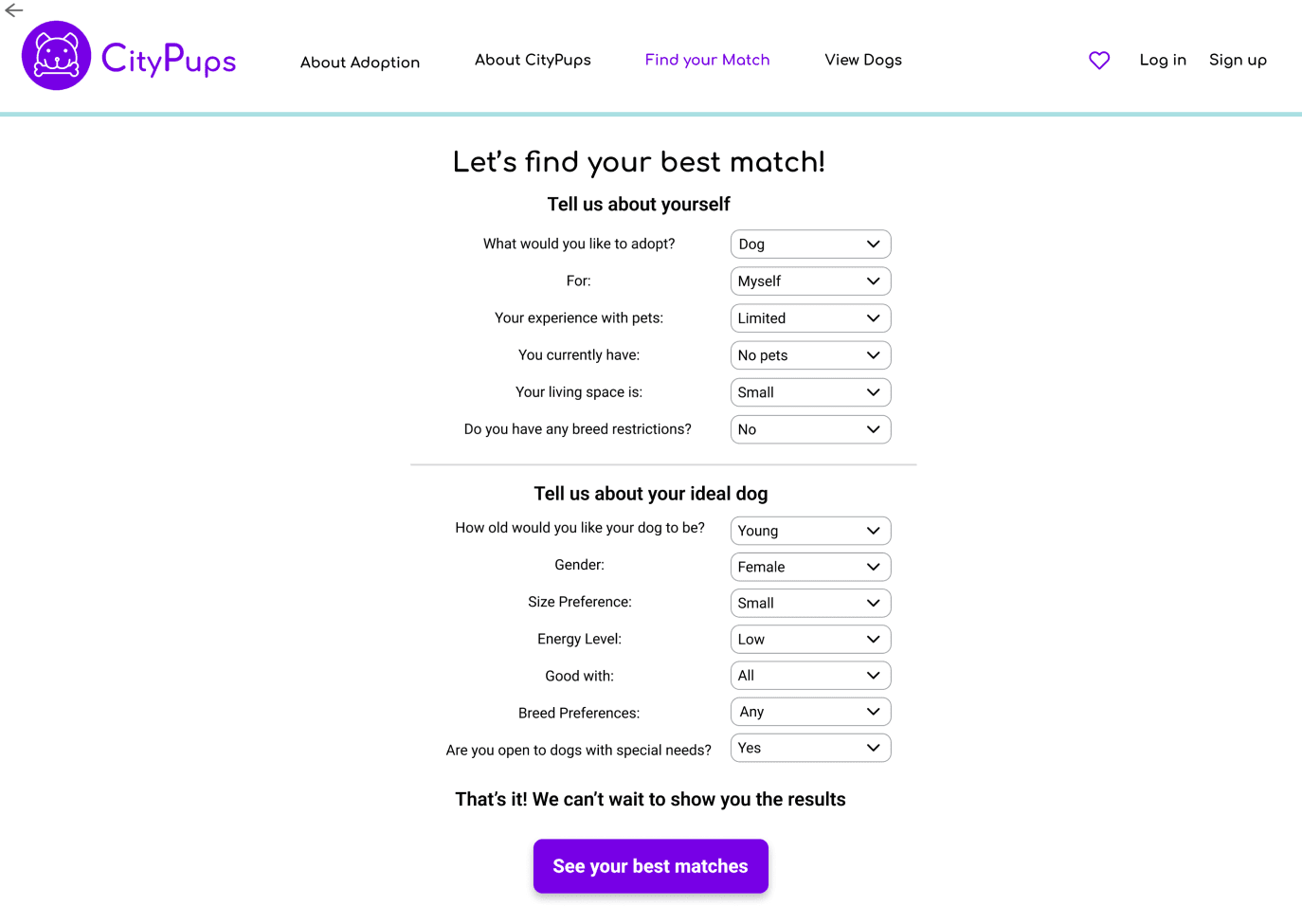
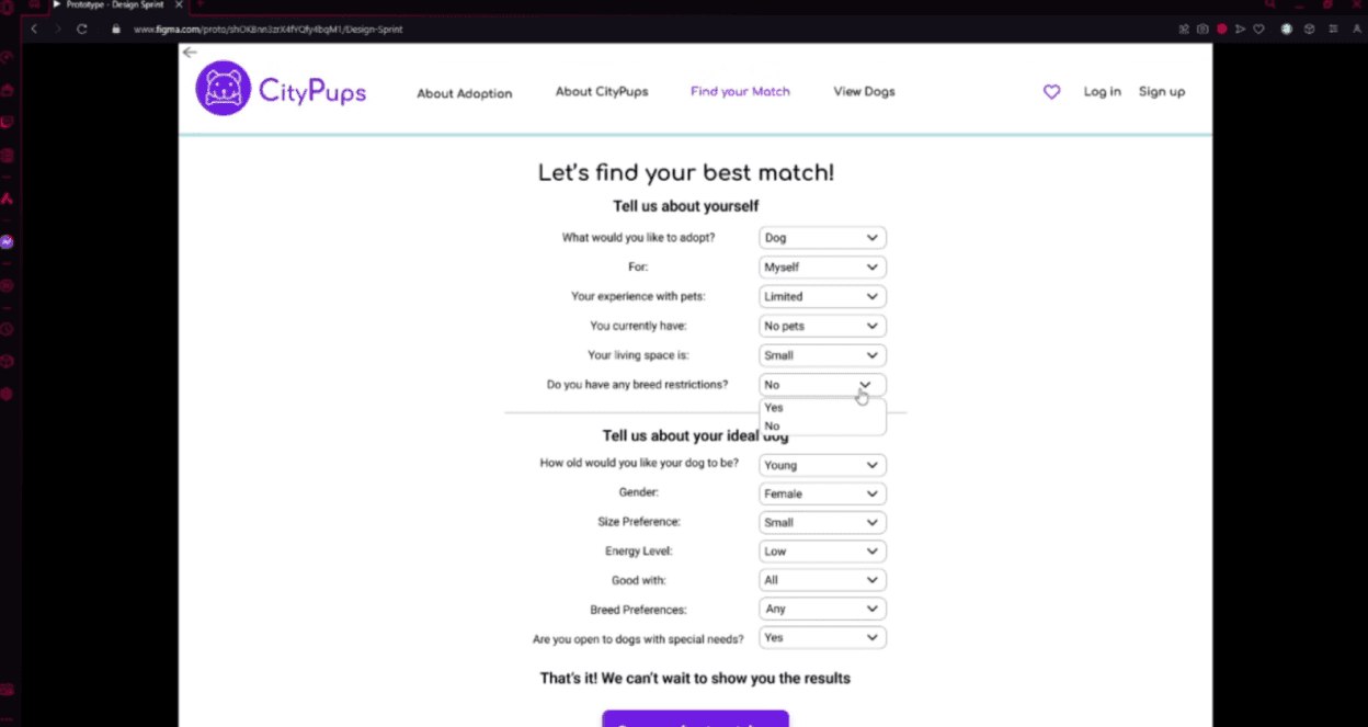
The "find your match" form takes a comprehensive list of questions, compiles the user's answers, and then outputs them into a personalized list of best matches.
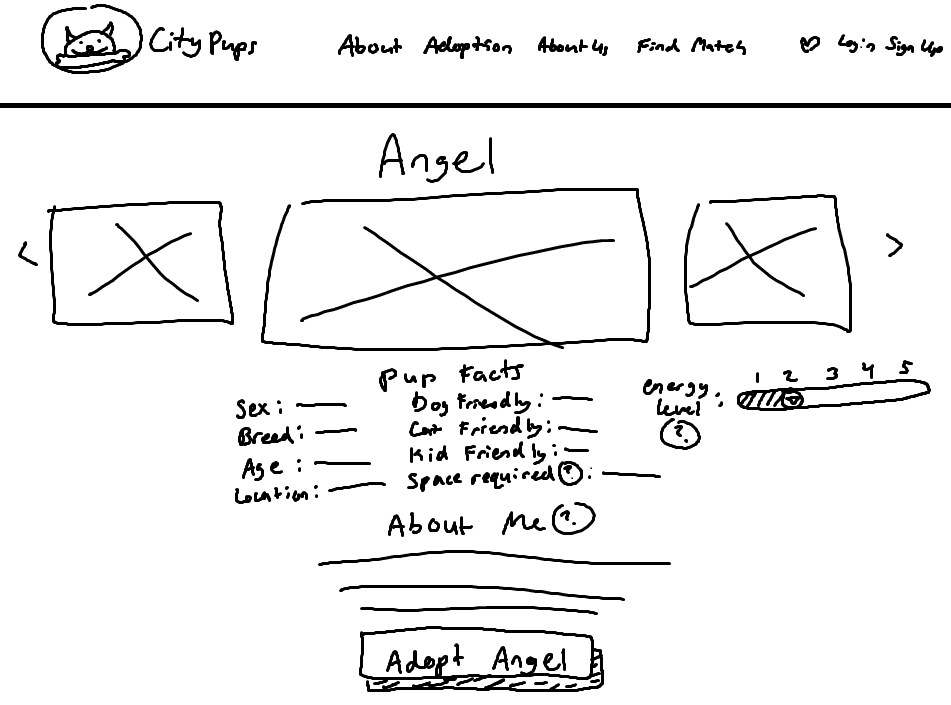
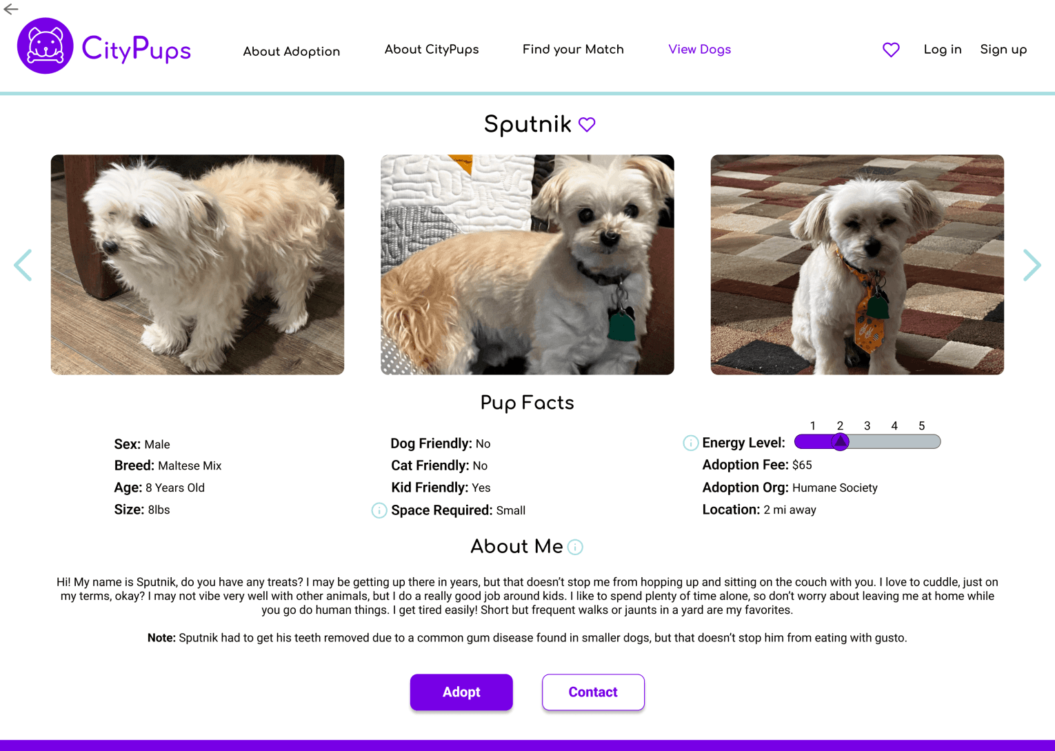
Finally, the Pup Page. Here they would be able to view media, the dog’s logistical facts (pup facts), and a personalized about me section that would provide any other additional information about the dog.
Diving into the prototypes and describing the main screens of the website
I prioritized creating the features I wanted to test: the find your match page, the catalog, and the pup pages.
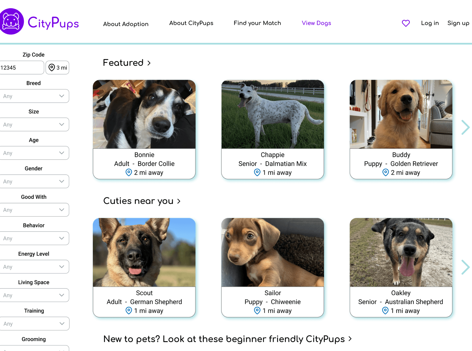
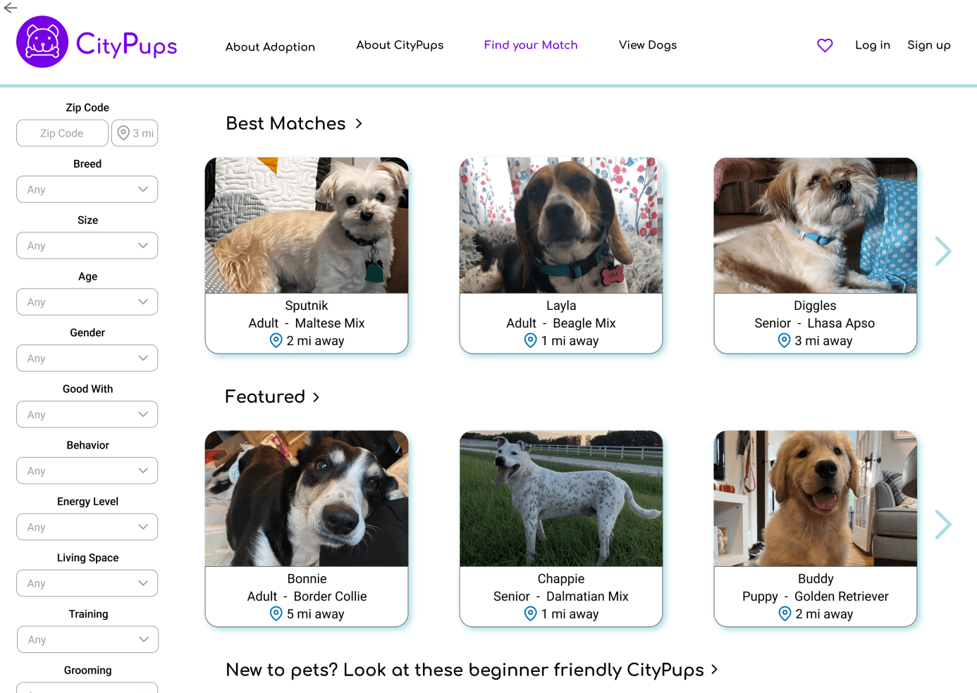
The next screen pictured below is the main “View Dogs” page that users browse through. Taking inspiration from my research, I implemented discoverable categories that allow users to merely browse the dogs if they do not know exactly what they are looking for. The comprehensive filter list I had wanted to include is also showcased on this page.
The following image is an example of what the pup page for an individual dog would look like. Here, the basic information and bio of the dog is showcased, photos and videos of the dog would be visible, and links to the adoption and contact page for the adoption organization are easily accessible. The information “i” buttons present the user with more detailed information about what each category describes or demonstrates. It is also important to note that each “about me” tab would include any known history of the dog, and any need to know facts the organization that is housing the dog is aware of such as medical history, the dog’s shot status, known behaviors, and more.
3. Validating through usability tests and addressing the feedback
I interviewed 5 different people by running them through a usability test of the CityPup designs. I utilized the five-act interview technique which included a friendly welcome, context questions, an introduction to the prototype, tasks across the span of the test, and a quick debrief. Due to time constraints, I conducted these interviews online while the participants streamed their computer screen so I could watch them interact with the product as they talked about what they were doing, demonstrated by the screenshot below.
Each participant had lived in a more densely populated city at one point in their lives, so they were able to speak as the target audience of this project. The atmosphere of the interviews were generally relaxed and fun, aided by the adorable dog photos, but I learned quite a bit about how the typical user would interact with a resource like CityPups.
Positive Feedback
All five of the participants had great impressions and reactions to the website overall. Without prompting, all five participants mentioned that they liked being able to see how far away the dog was from them, which affirms that the design addresses one of the main goals this website is trying to achieve: helping users find dogs to adopt near them.
“Some people can’t go very far away for a pet, so [distance] is a very nice thing to show.”
All of the participants also mentioned that the “about me” section of the pup pages would help them connect with the dog through the use of the dog’s voice. Finally, all five participants concluded that the website itself was very intuitive and well put together which affirmed that the website is usable.
Constructive Criticism
There were no critical errors that appeared during the usability tests. However, the participants did find smaller things that needed tweaking.
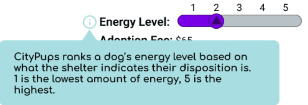
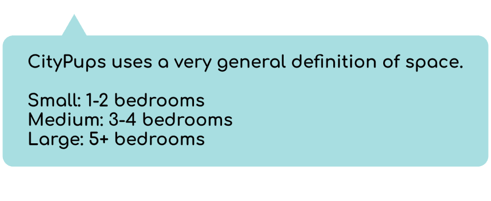
Three of the participants also mentioned that the energy level indicator needed to either be changed or better defined, as it was a bit unclear in intention. They also wanted a better definition of space needed, one even mentioned adding square footage to really gauge what the scale of small to large meant.
Four of the participants experienced confusion from the layout of the results page after they completed the best match form. They did not realize that there were other categories such as “featured” and “new to pets?...” and mentioned that they assumed those dogs were also part of the best match results.
Two participants mentioned that they really wanted to see a gender marker on each of the dog’s listing cards because that was a big part of their decision making process when choosing a dog.
All of that said, I proceeded to iterate and make changes based on the feedback from the usability tests. Allow me to walk you through the most recent iteration and final product for CityPups.
4. What can Citypups do for you? The final product in review
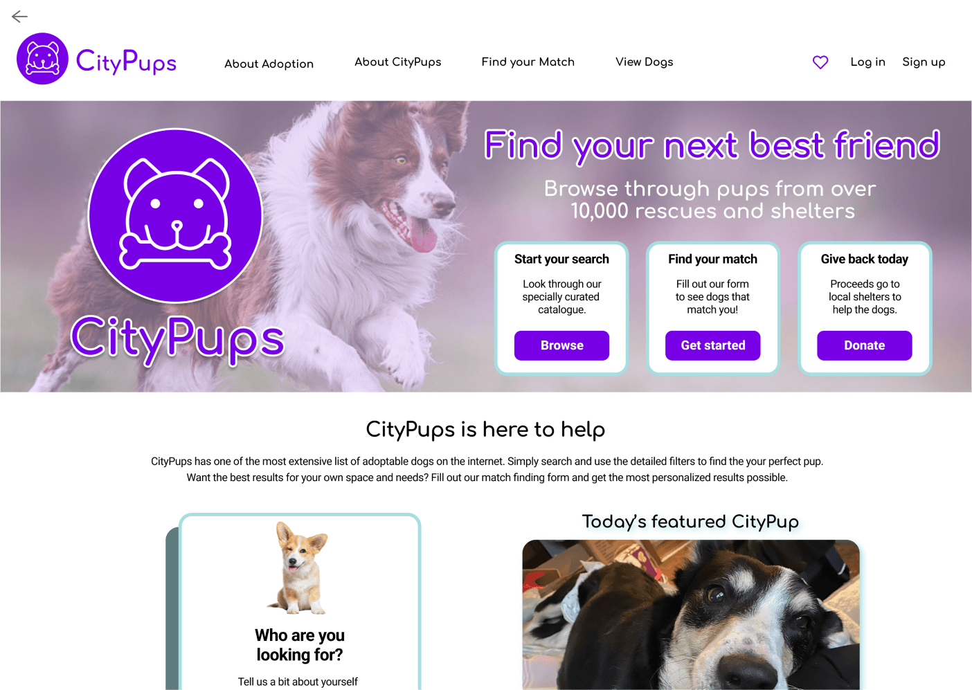
Welcome to Citypups, we’re here to find your best best friend. Browse through one of the most extensive online catalog of dogs from over 10,000 rescues and shelters across the United States, or search in your geographical area by inputting your zip code.
Find your best matches
Don’t know exactly what you’re looking for? That’s okay! Try out CityPup’s find your match feature. Once you’ve selected your answers, Citypups will narrow down the results to a list especially curated to match your wants and needs.
Search with confidence
If these dogs don’t seem like the perfect fit, feel free to explore the rest of your options by looking through the catalog. Are you looking for a dog that is recommended for new pet owners? Would you like to see which dogs CityPups recommends? CityPups makes finding dogs a breeze with discoverable categories and detailed filters. CityPups wants to help you find exactly who you’re looking for.
CityPups does the hard work for you
When you find a dog that interests you, visit their pup page to see their basic information and learn about their personality. Citypups does the hard work for you. Everything the adoption organization knows about the pup such as their known history, medical records, and thoughts on their disposition will be here ready to go so you can skip those long, tedious inquiry calls. View photos and videos of the pup in question to really see their body language, movement, and personality in action.
5. Wrapping it all up with the numbers
Based on user feedback, CityPups is a resource that would be shared with friends and family 100% of the time. Users also report a very high satisfaction rate at 100%.
100% Recommended Resource
100% User Satisfaction
Based on user experience with CityPups
Let's talk!
cassiehonasdesigns@gmail.com